Contact Me
Back to Work
B2B Data Analytics Dashboard Design UX Research

PepsiCo โ€“ Redesigning Dashboards to Provide Stakeholders with Prioritized, Efficient Insights

Transforming a fragmented internal analytics dashboard into a unified, insight-driven experience โ€” improving data submission efficiency, reducing processing time, and achieving high stakeholder satisfaction.

๐Ÿ™‹ Role
Product Designer
(team of 2 UXRs, 4 UXDs)
โณ Period
4 months, 2022
๐Ÿ“‚ Responsibilities
End-to-end product design, UX research, heuristic evaluation, usability testing, design system, stakeholder collaboration
โš™๏ธ Tech
Figma, Miro
๐Ÿ“ Location
Remote, USA ๐Ÿฅค
PepsiCo E2E Waste Diagnostic โ€” final dashboard screens

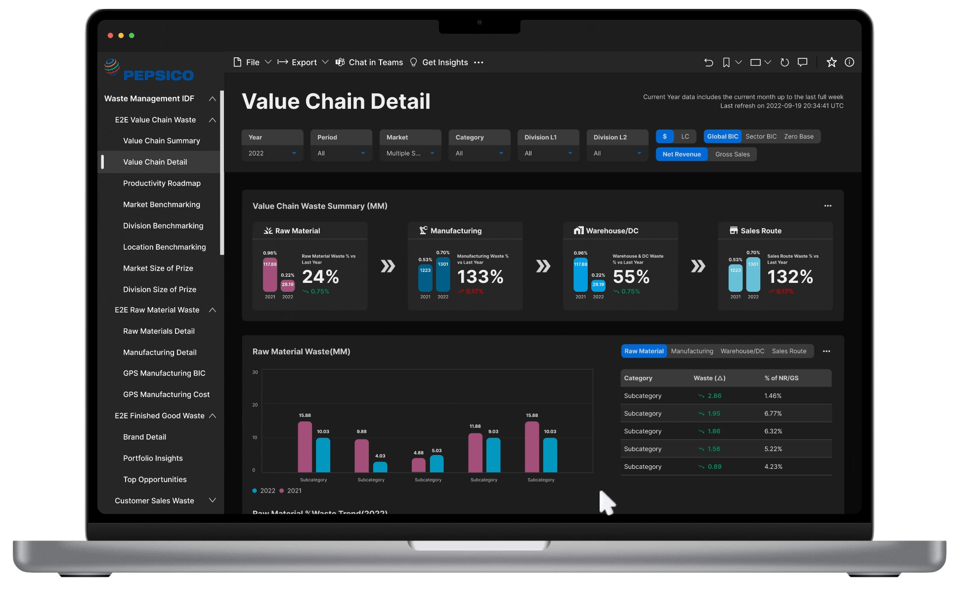
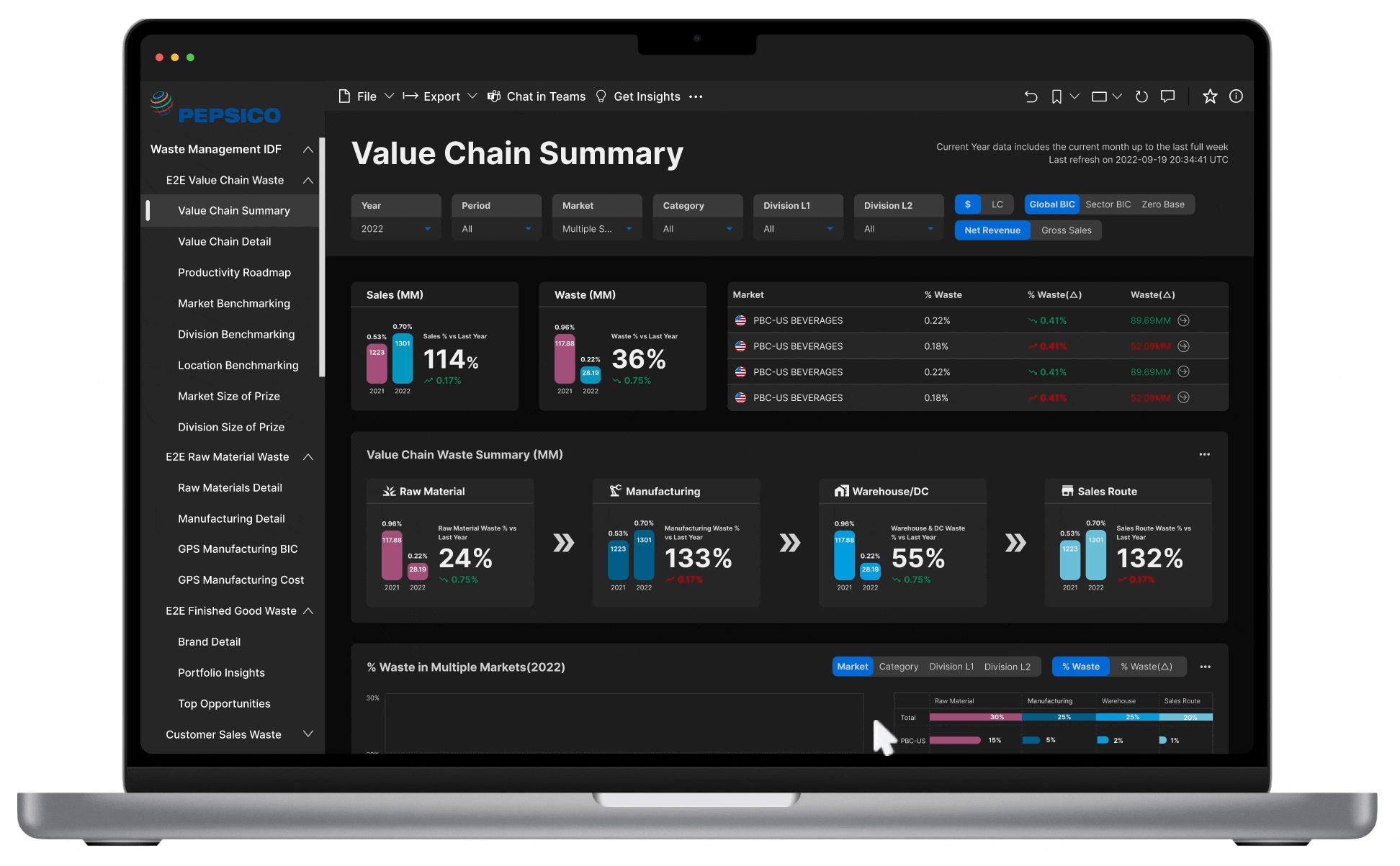
What is the E2E Waste Diagnostic?

PepsiCo's E2E (End-to-End) Waste Diagnostic is an internal analytics tool used by market leads, supply chain managers, and executives to monitor material waste across the entire value chain โ€” from raw materials through to sales.

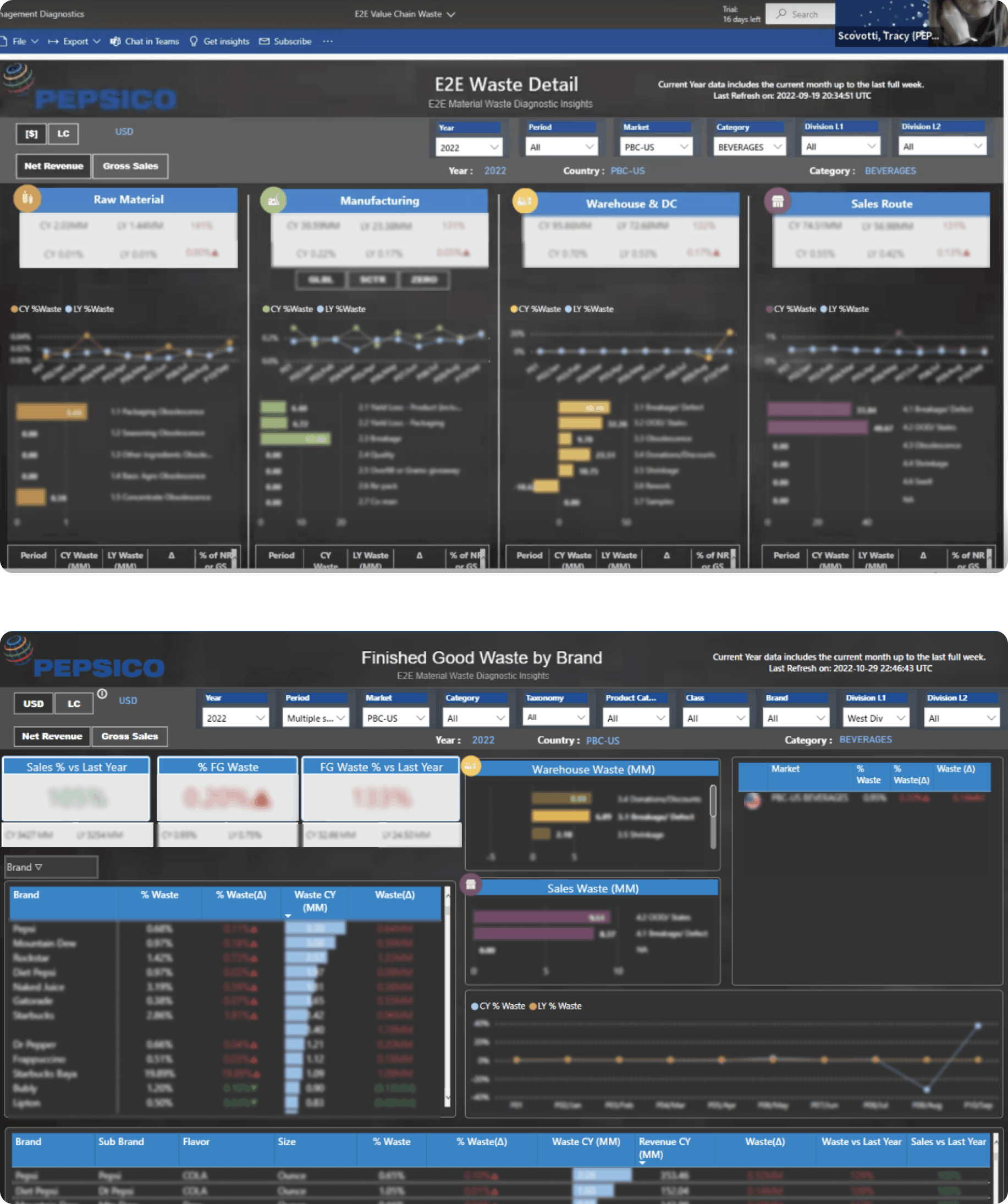
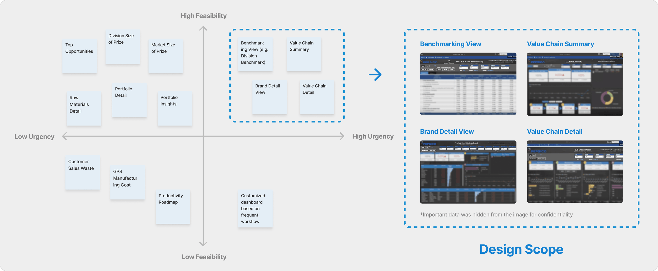
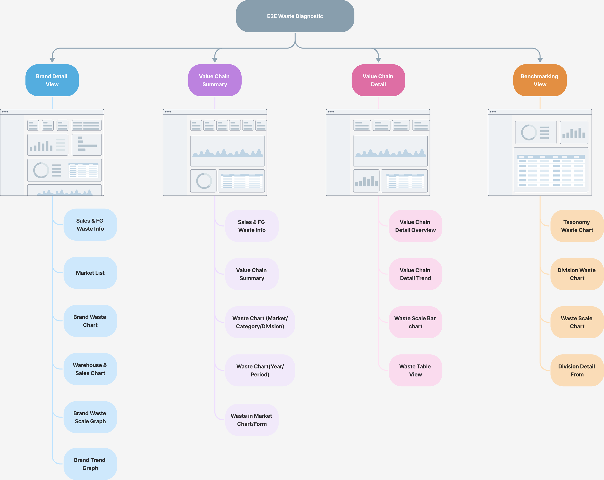
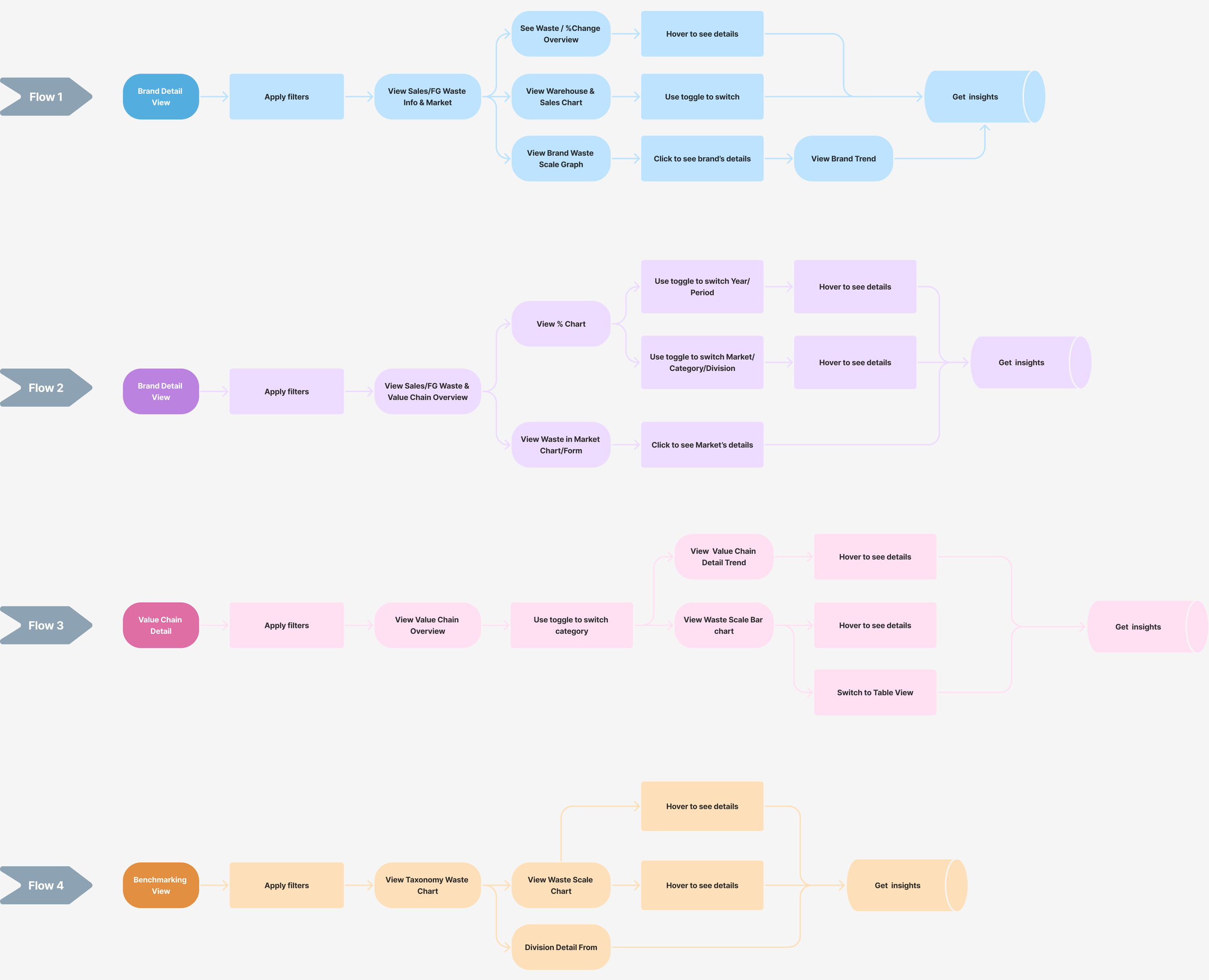
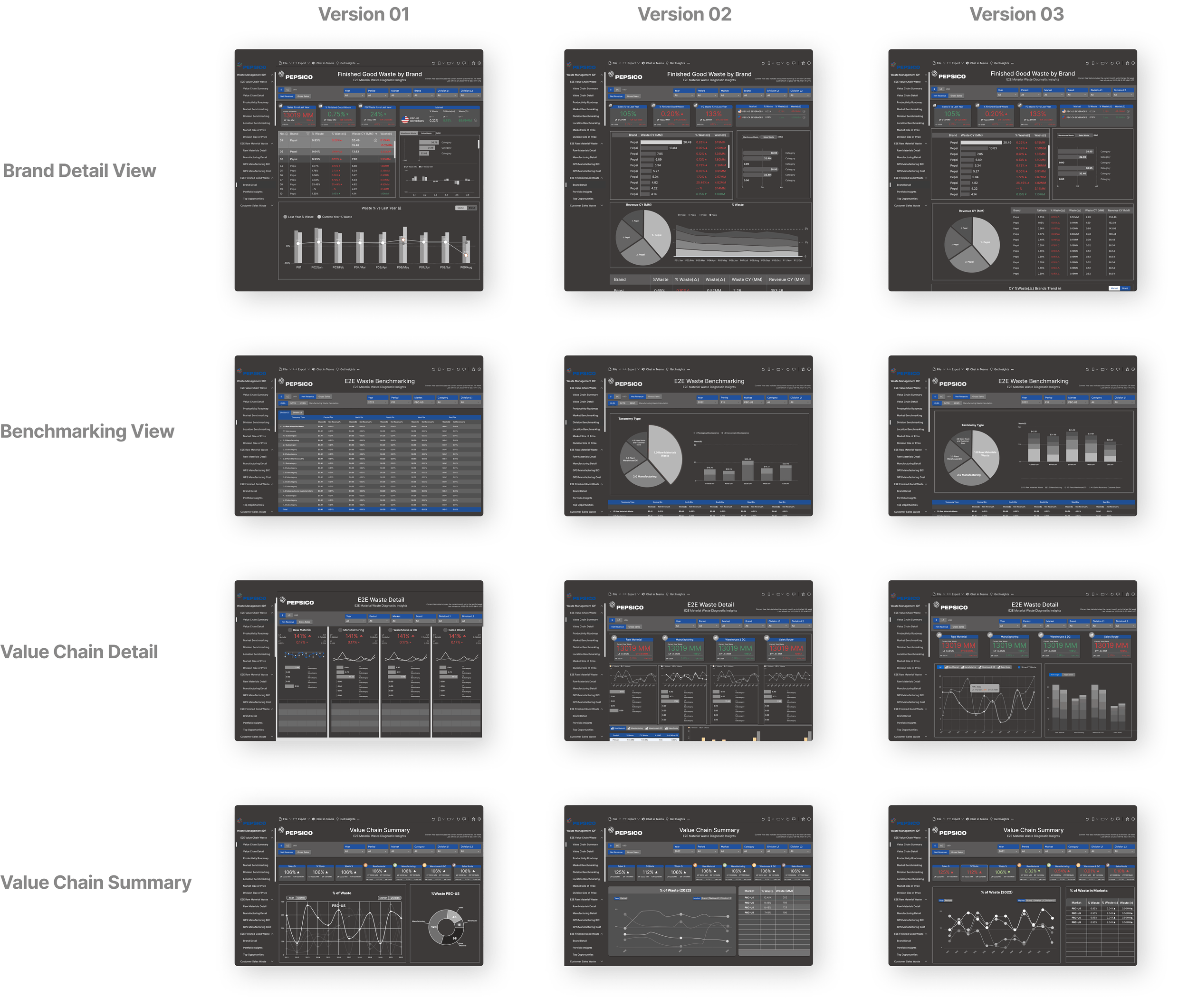
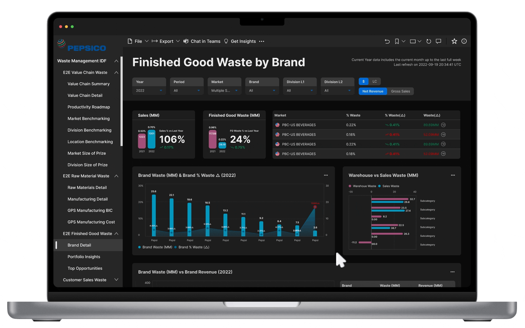
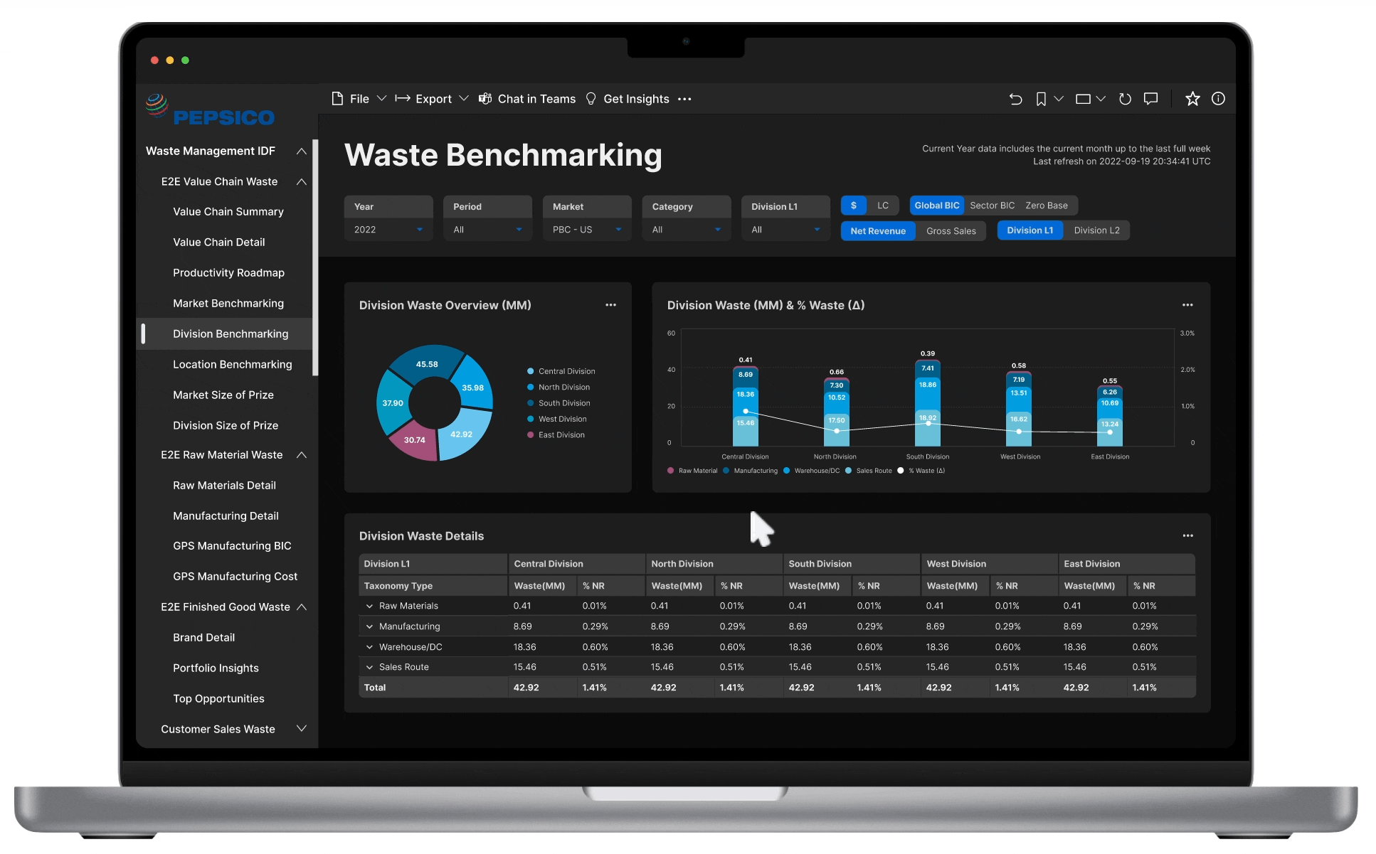
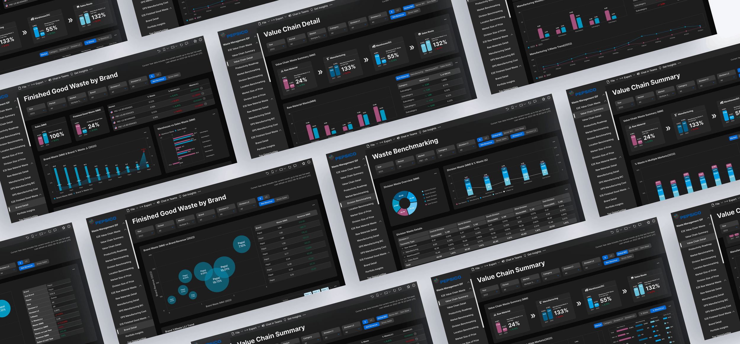
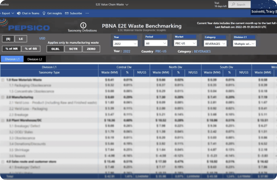
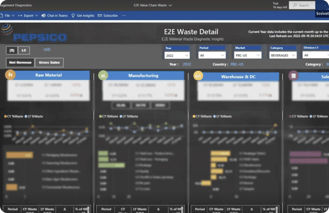
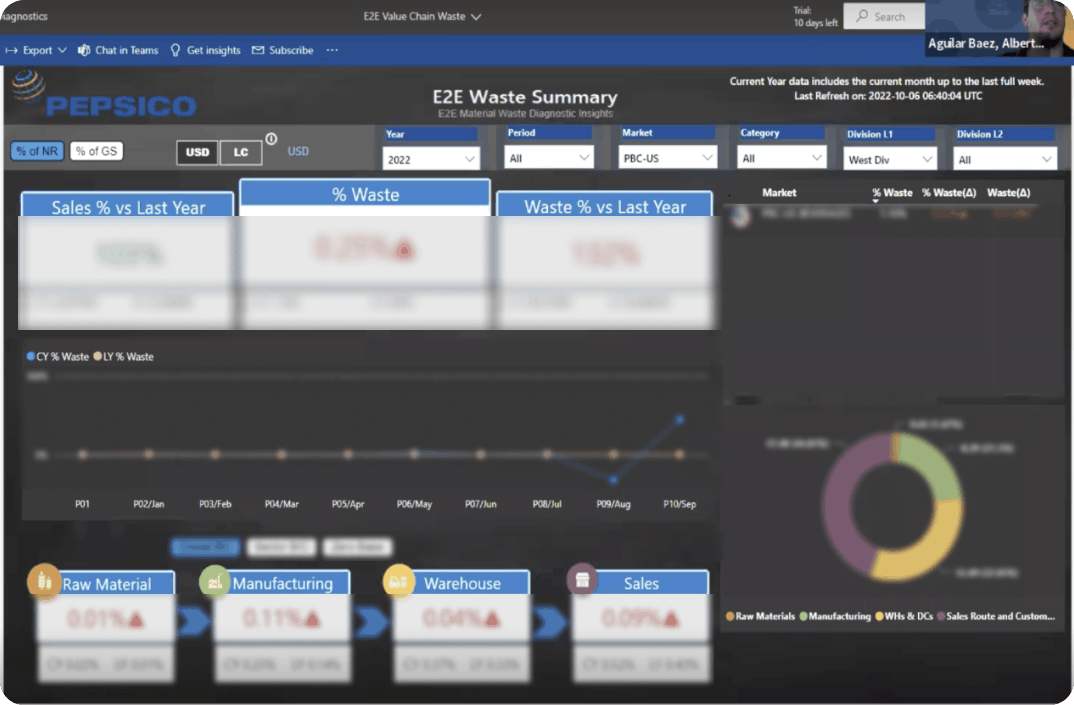
The tool covered four page types: Brand Detail View, Value Chain Summary, Value Chain Detail, and Benchmarking View. Before the redesign, all four pages were dense, inconsistent, and difficult to navigate โ€” making it hard for stakeholders to extract the insights they needed.
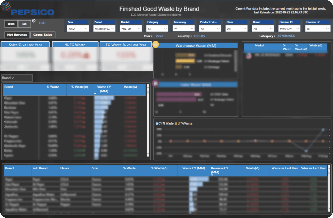
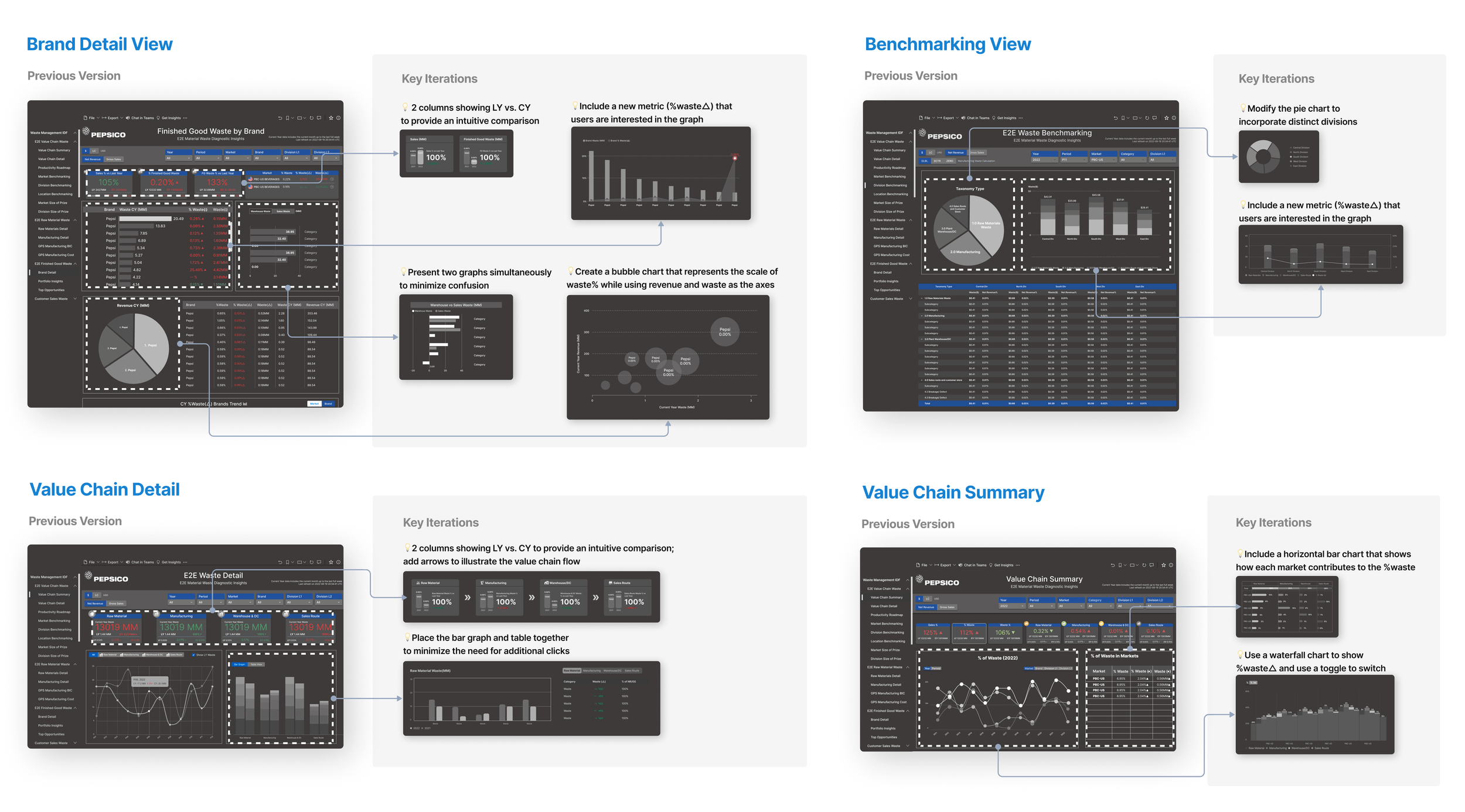
Insufficient Dashboard of Impactful Insights

The existing tool was data-rich but insight-poor. Stakeholders had to manually sift through dense tables and disconnected charts to find what mattered โ€” and even then, the lack of visual hierarchy made it unclear what to act on.

๐Ÿ“Š

No Data Prioritization

All metrics carried equal visual weight. There was no hierarchy to guide stakeholders toward the most impactful insights first.

๐Ÿ”—

Disconnected Pages

Brand Detail, Benchmarking, and Value Chain pages felt like separate tools โ€” inconsistent layout, navigation, and visual language across all four.

โฑ๏ธ

Slow Decision-Making

Stakeholders spent significant time just interpreting raw data before they could act on it โ€” defeating the purpose of an analytics tool.

Current state โ€” E2E Waste Detail and Finished Good Waste by Brand
Current state โ€” E2E Waste Detail (top) and Finished Good Waste by Brand (bottom): cluttered layouts, no clear entry point for insights

Understanding the Problem Space

Before jumping into design, we formulized a discovery process to build a clear picture of who was using the tool, how they used it, and where it was breaking down.

01

Stakeholder Interviews

Conducted moderated interviews with market leads, supply chain managers, and analytics stakeholders to understand current workflows, pain points, and the business decisions the tool needed to support.

02

Heuristic Evaluation

Applied Nielsen's 10 usability heuristics to systematically audit the existing dashboard, surfacing critical violations around visibility of system status, consistency, and user control.

03

Walkthrough Observations

Facilitated moderated task walkthroughs with 6 stakeholders across business functions โ€” observing how they actually navigated the tool versus how it was intended to work.

Stakeholder interview โ€” video call session
Stakeholder interview session โ€” gathering first-hand insights on pain points and workflow needs

Who are we designing for?

Two primary user personas emerged from research โ€” each with distinct data needs and frustrations with the existing tool.

Persona โ€” Tracy, Market Lead
Persona โ€” Matt, Supply Chain Lead
Tracy (Market Lead) and Matt (Supply Chain Manager) โ€” two distinct stakeholders with different but overlapping needs

Journey Map

Mapping the end-to-end user journey revealed that emotional low points clustered around stages 2 and 3 โ€” viewing the holistic data and discovering issues โ€” precisely where the existing tool's information architecture and visualizations failed most.

User journey map โ€” 5 stages from applying filters to getting insights
Click to expand
Journey map โ€” stages when users experienced a significant drop in emotions and provided the majority of negative feedback

Defining the Design Scope

With research complete, I ran a feasibility-urgency prioritization exercise to determine which pages to redesign first. Four page types landed in the high feasibility + high urgency quadrant โ€” becoming the design scope for this project.

Priority matrix โ€” feasibility vs. urgency with design scope highlighted
Click to expand
Priority matrix โ€” Brand Detail View, Benchmarking View, Value Chain Summary, and Value Chain Detail selected as design scope
Design scope: Brand Detail View ยท Benchmarking View ยท Value Chain Summary ยท Value Chain Detail โ€” four pages, unified into one coherent experience.

From Research to Refined Design

The design process moved through information architecture, user flows, and multiple rounds of iteration โ€” with stakeholder check-ins at each stage to validate direction early.

Step 1
Information Architecture

Defining the IA

We mapped out the complete information architecture of the E2E Waste Diagnostic โ€” how the four page types connected, what data lived where, and how components within each page related. This surfaced structural problems invisible at the UI level.

Information architecture โ€” E2E Waste Diagnostics page structure
Click to expand
IA map โ€” Brand Detail View, Value Chain Summary, Value Chain Detail, and Benchmarking View with their component breakdowns
Step 2
User Flows

Mapping User Flows

We designed four distinct user flows โ€” one per page type โ€” tracing how each persona would move through the tool from applying filters through to extracting insights. Flows revealed redundant steps and unclear decision points that became redesign priorities.

User flows โ€” four flows for Brand Detail, Value Chain Detail, and Benchmarking
Click to expand
User flows โ€” Flows 1โ€“4 mapping the path from filter selection through to insight extraction for each page type
Step 3
Iteration

Key Iterations

Each page type went through targeted iterations โ€” comparing the previous version against specific design hypotheses. Key changes included adding visual summary metrics, introducing intuitive comparison tools, and placing the bar and line graphs together to eliminate additional clicks.

Iteration 1 โ€” key changes per page type with annotations
Click to expand
Key iterations โ€” before/after comparisons with annotated rationale for Brand Detail, Benchmarking, Value Chain Detail, and Value Chain Summary

Each page type went through three full design versions before reaching the final state โ€” progressively improving data visualization clarity, reducing cognitive load, and increasing information density where it added value.

Iteration 2 โ€” Version 01, 02, 03 for all four page types
Click to expand
Version 01 โ†’ 02 โ†’ 03 progression across all four page types: Brand Detail, Benchmarking, Value Chain Detail, and Value Chain Summary

Establishing a Design System for Visual Consistency

To ensure a consistent visual language across all four dashboard pages โ€” and to enable future expansion โ€” we built a design system in Figma covering colors, typography, form elements, selectors, filters, and chart components.

Goal: Establish a design system to ensure visual consistency across all pages โ€” reducing design debt and enabling faster, more consistent development going forward.
PepsiCo design system โ€” colors, typography, forms, selectors, and chart components
Click to expand
Design system โ€” color palette, typography scale, form components, selectors, filters, and chart library for the E2E Waste Diagnostic

Final High-Fidelity Designs

The four prioritized page types โ€” Brand Detail View, Value Chain Summary, Value Chain Detail, and Benchmarking View โ€” were fully redesigned into high-fidelity, interactive prototypes. Each page addresses the specific pain points surfaced during discovery, with clearer information hierarchy, streamlined navigation, and consistent visual language.

Final design โ€” Brand Detail View
Page 1 โ€” Brand Detail View: Redesigned to surface brand-level KPIs and waste metrics at a glance, with a collapsible filter panel and clearer data grouping.
Final design โ€” Value Chain Summary
Page 2 โ€” Value Chain Summary: Streamlined overview of waste across the full value chain, with a prioritized breakdown and one-click drill-down into detail views.
Final design โ€” Value Chain Detail
Page 3 โ€” Value Chain Detail: Deep-dive view for individual value chain stages, with comparative charts and contextual benchmarking callouts.
Final design โ€” Benchmarking View
Page 4 โ€” Benchmarking View: Side-by-side market comparison with ranked performance indicators, enabling market leads to quickly identify outliers and opportunities.

Results from Stakeholder Usability Testing

The redesign was validated through moderated usability sessions with key stakeholders across market lead and supply chain functions. Participants completed representative tasks using the high-fidelity prototype โ€” measuring time-on-task, ease of navigation, and overall satisfaction against the existing tool.

Note: These results are based on prototype testing with internal stakeholders, not a live product launch. The redesign was handed off to the development team for implementation.
๐Ÿ“ค
65%
faster task completion on data submission workflows in prototype testing
โฑ๏ธ
30%
reduction in time-on-task for locating key insights vs. the existing tool
โญ
95%
of participants rated the redesign easier to use than the current dashboard

What are our plans for future improvements?

The redesign achieved its core objectives, and the process revealed four clear opportunities for continuing to evolve the tool.

Next steps โ€” Exploration, Customization, Education, Endorsement
Next steps โ€” four focus areas identified for future iterations of the E2E Waste Diagnostic