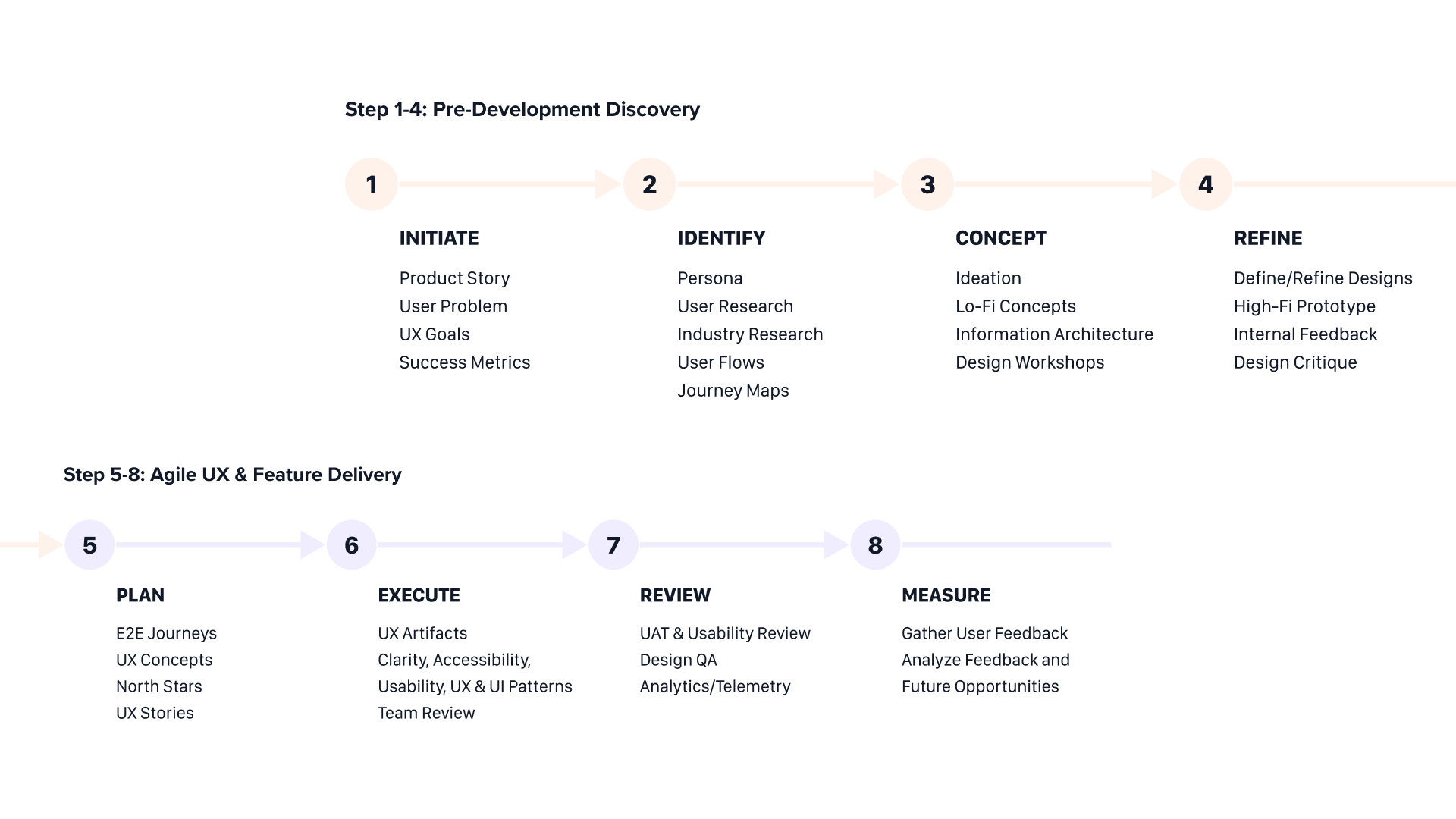
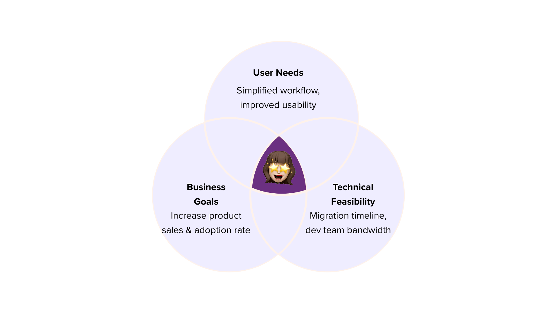
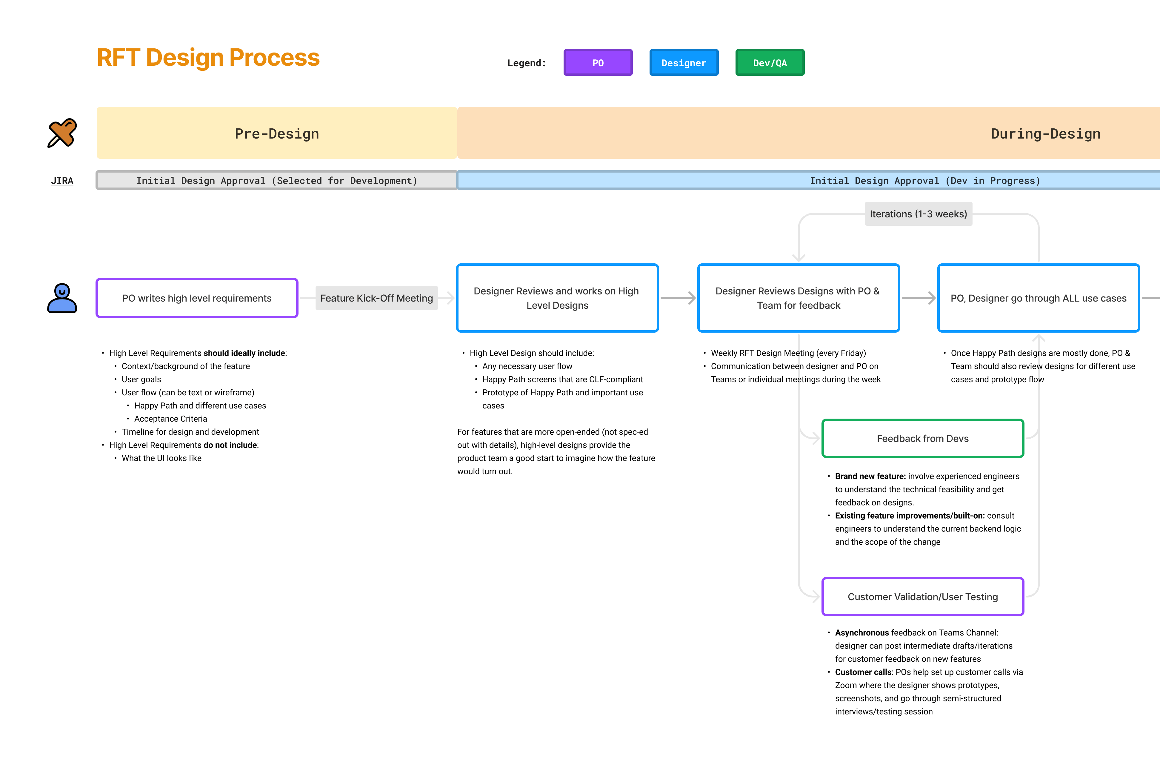
What is my redesign journey?
Upon designing, my first goal was to refine the information architecture of Network Detective Pro, as it supports countless features and cannot be migrated overnight.
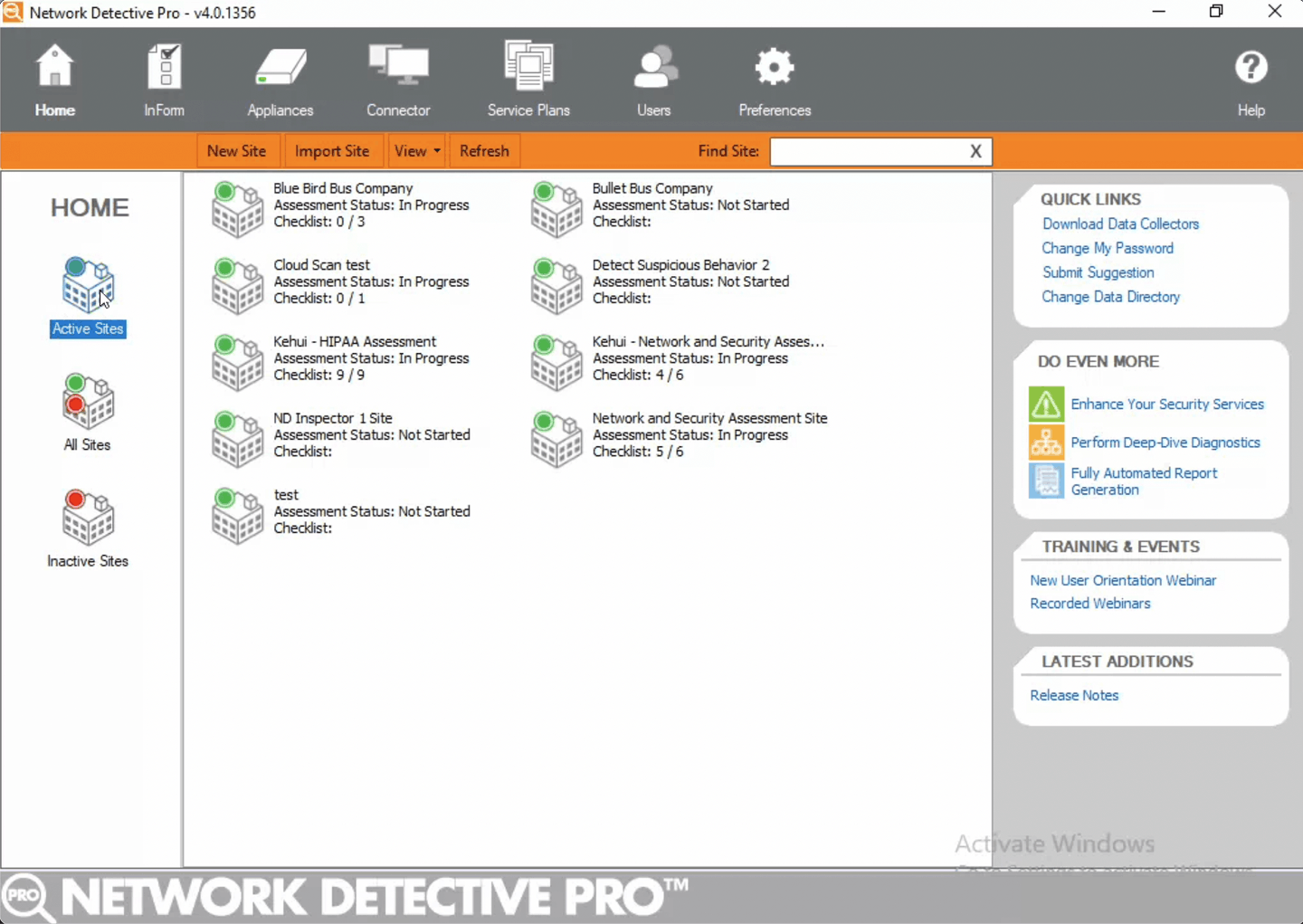
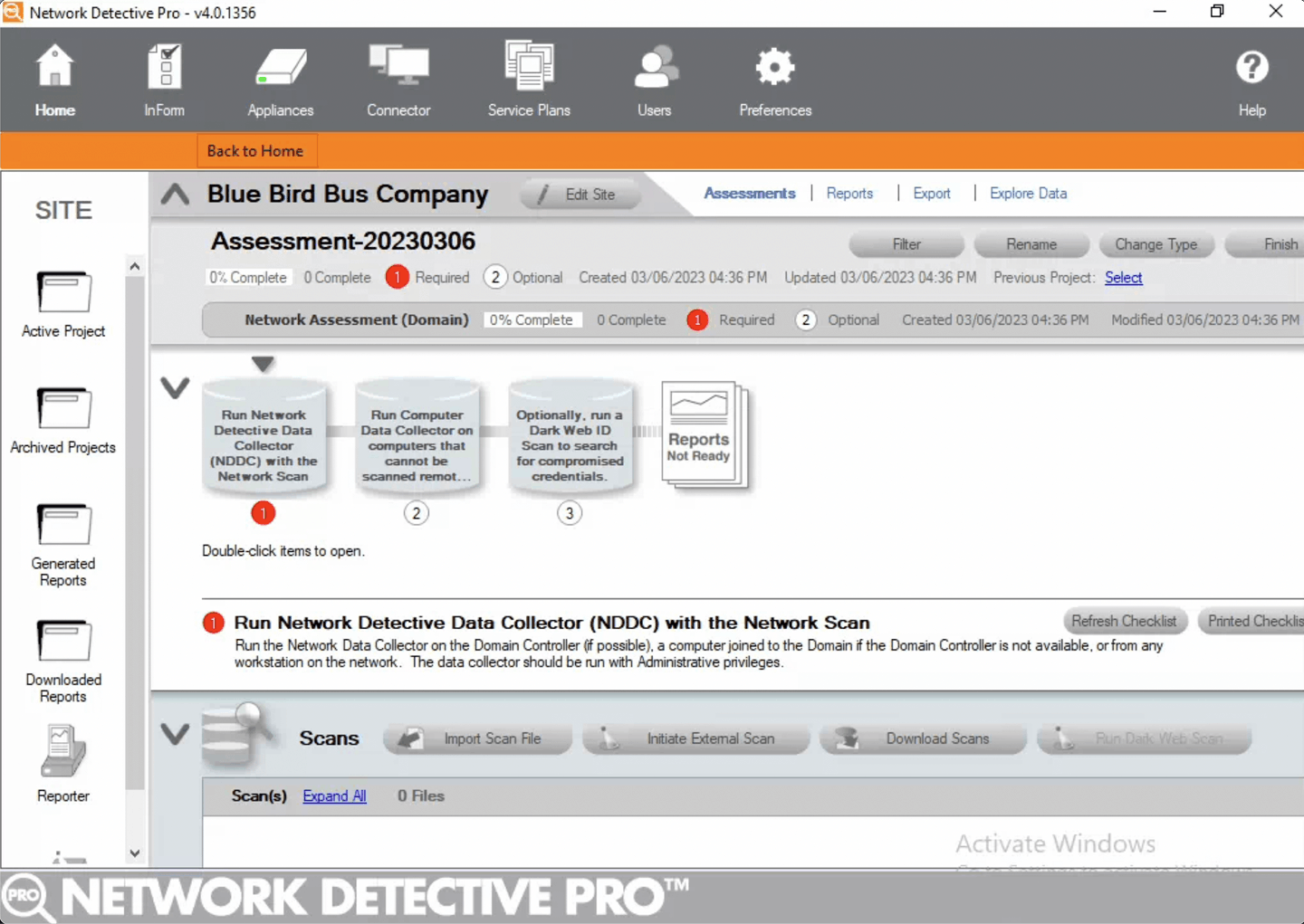
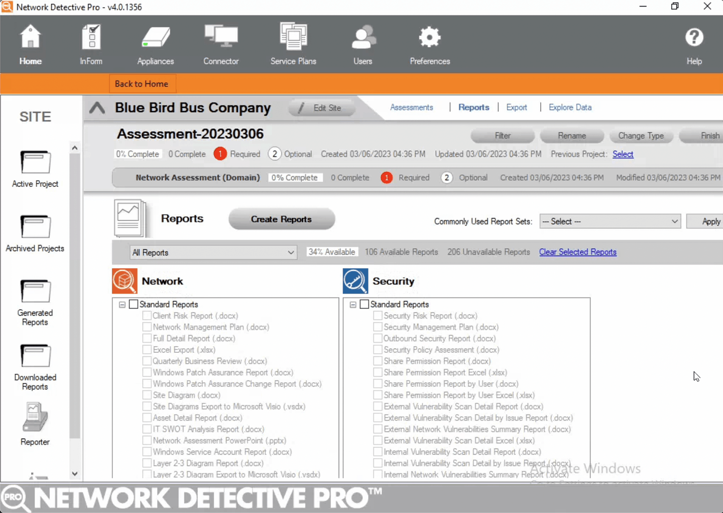
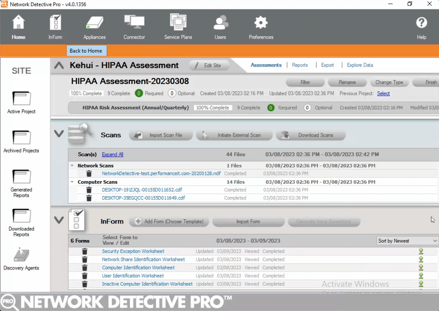
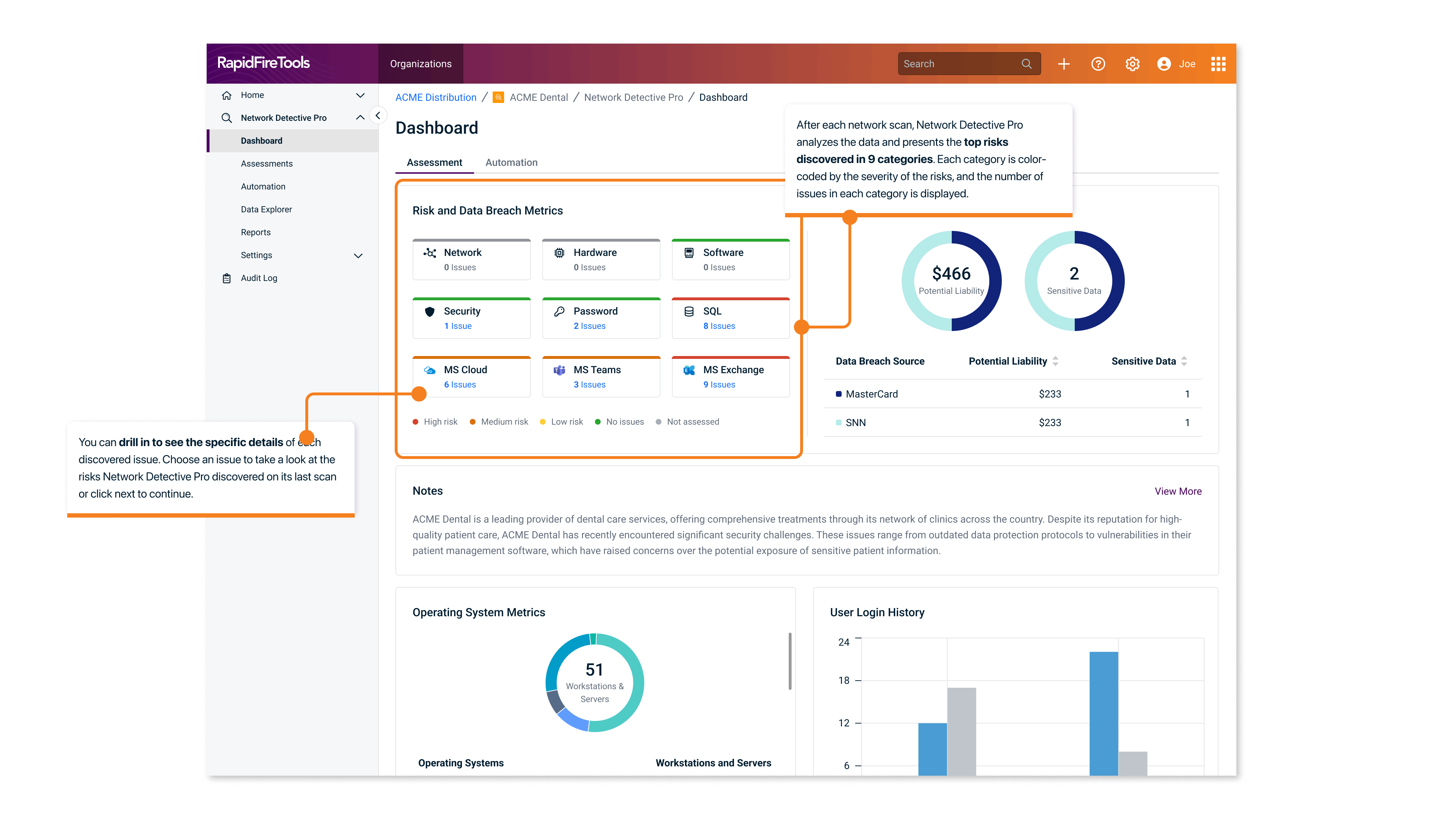
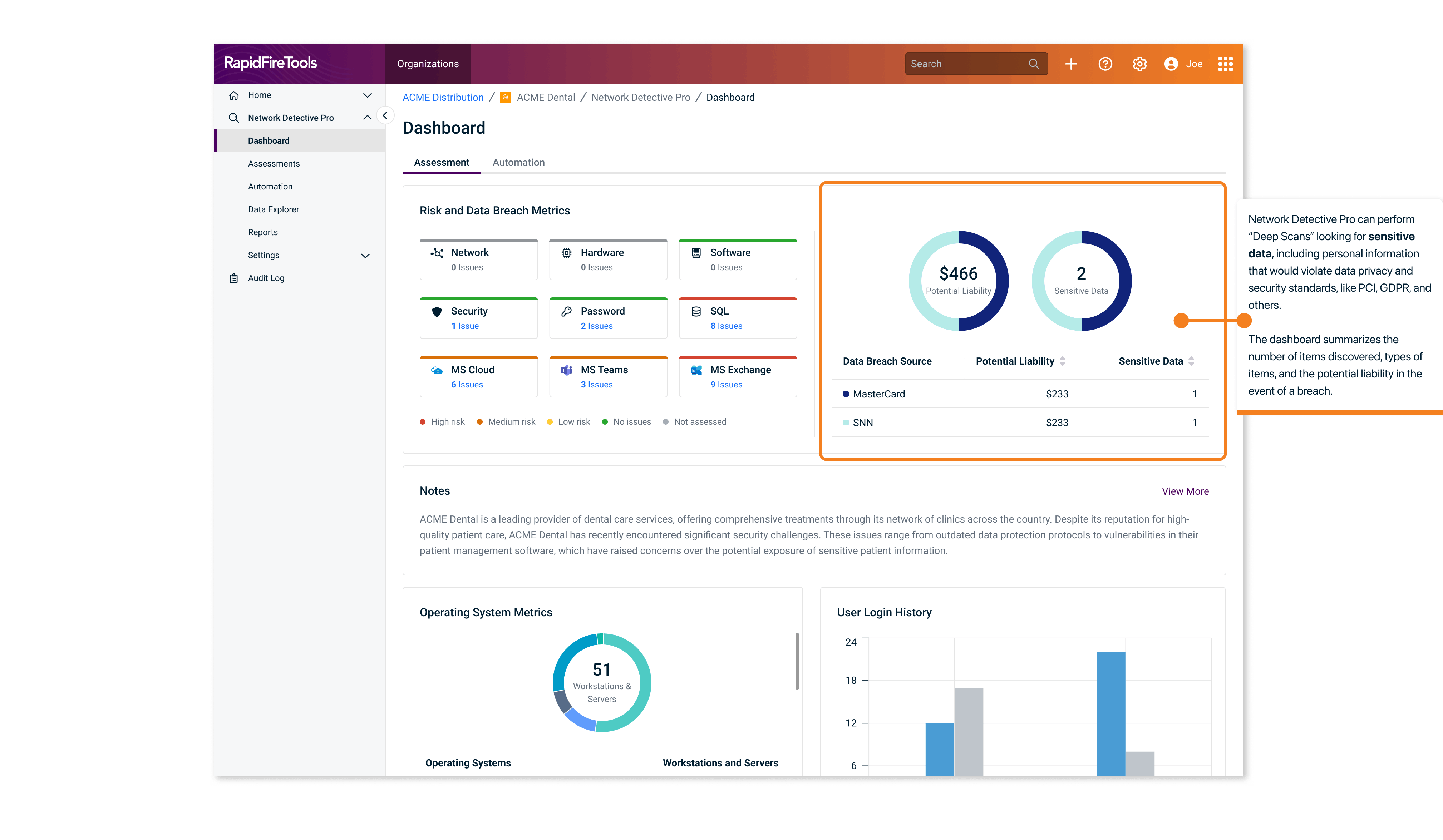
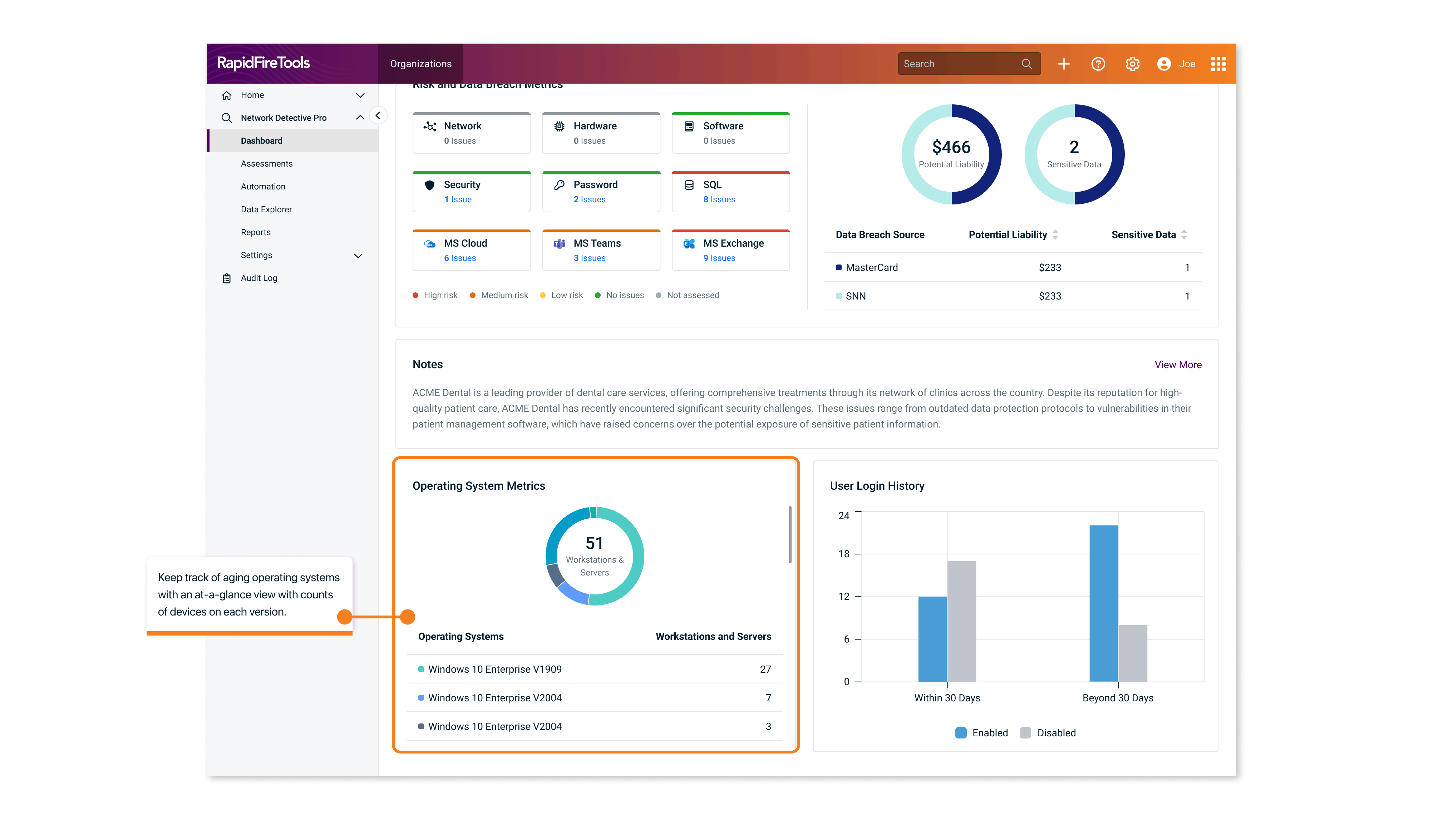
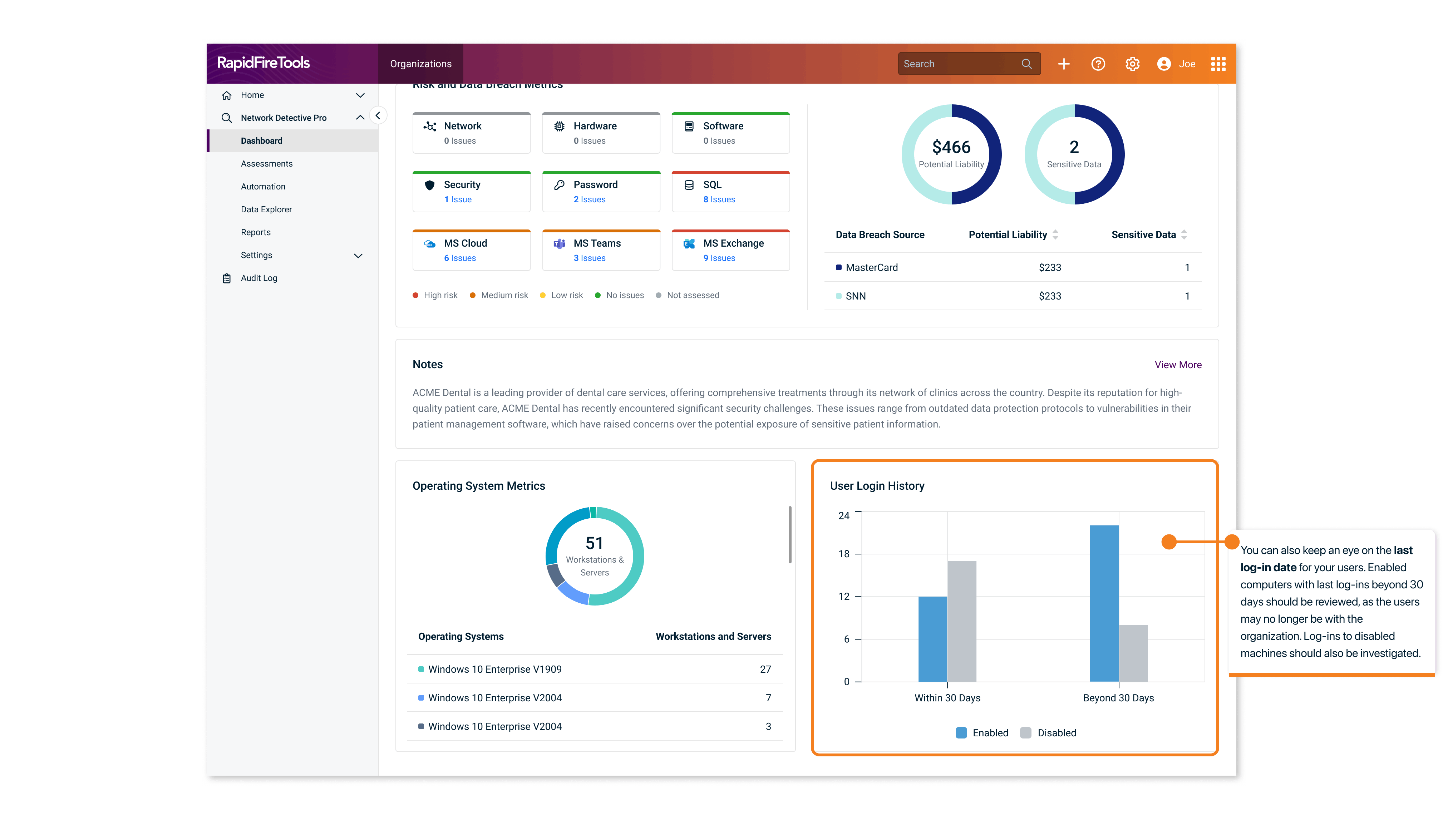
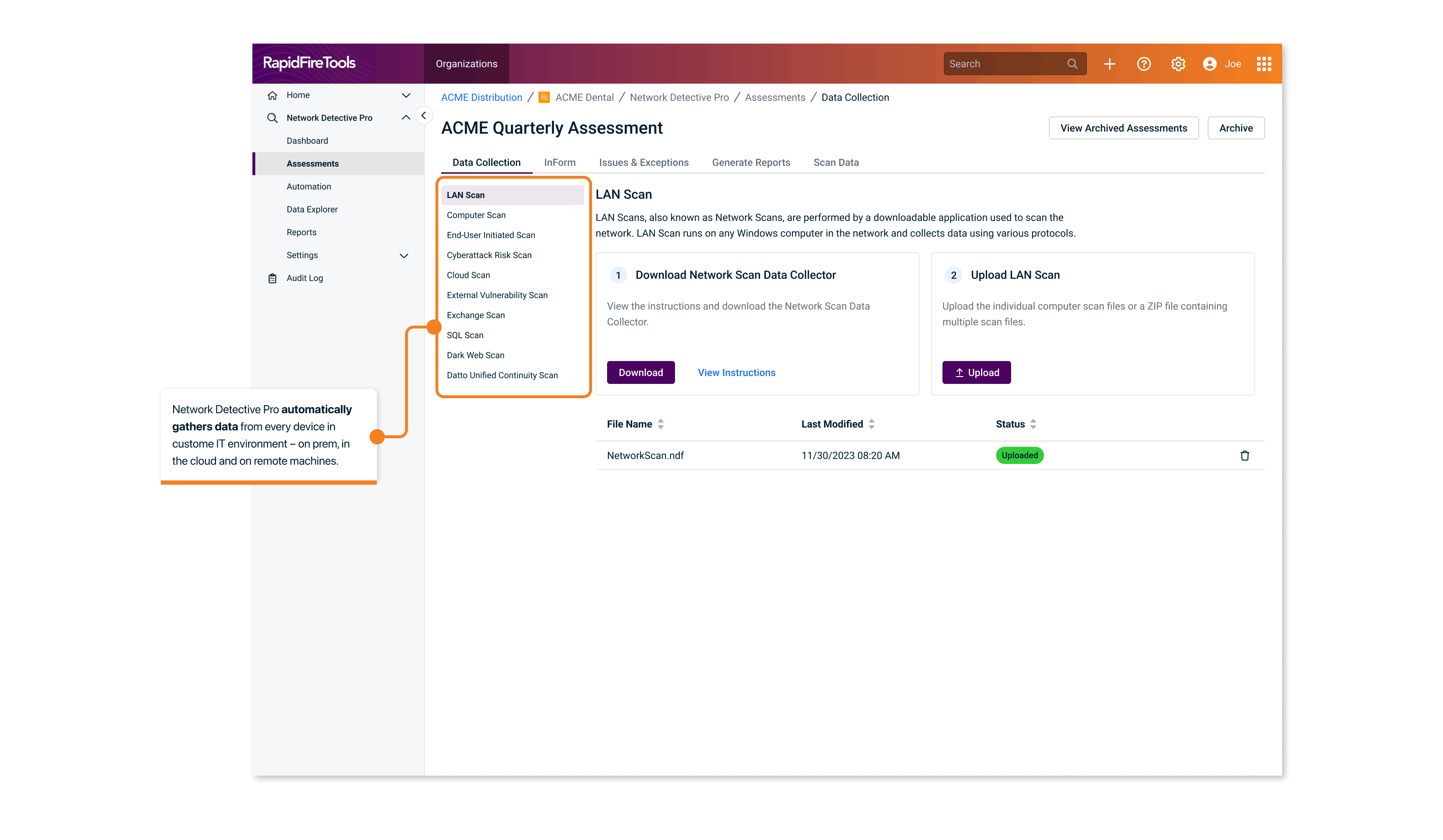
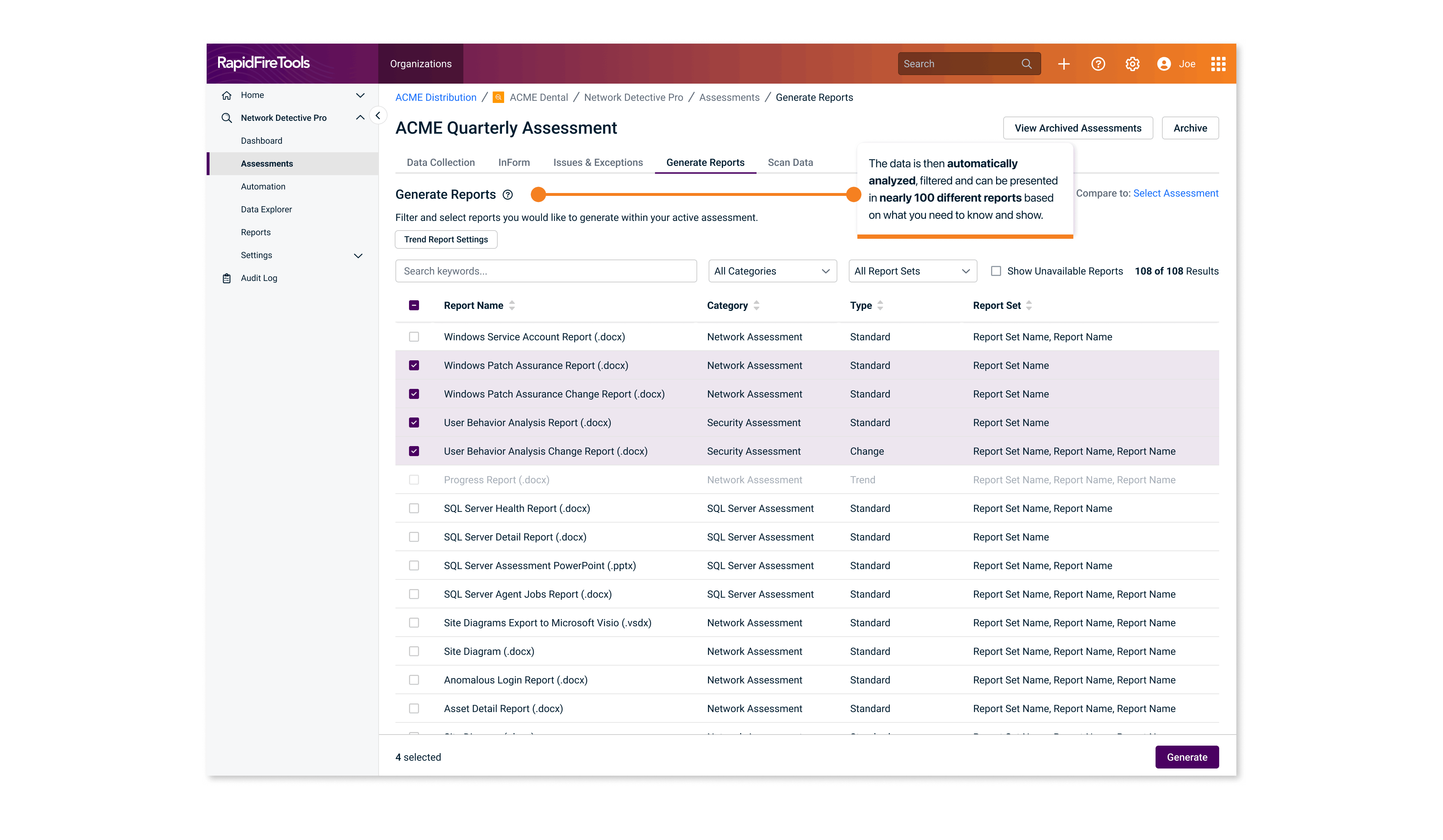
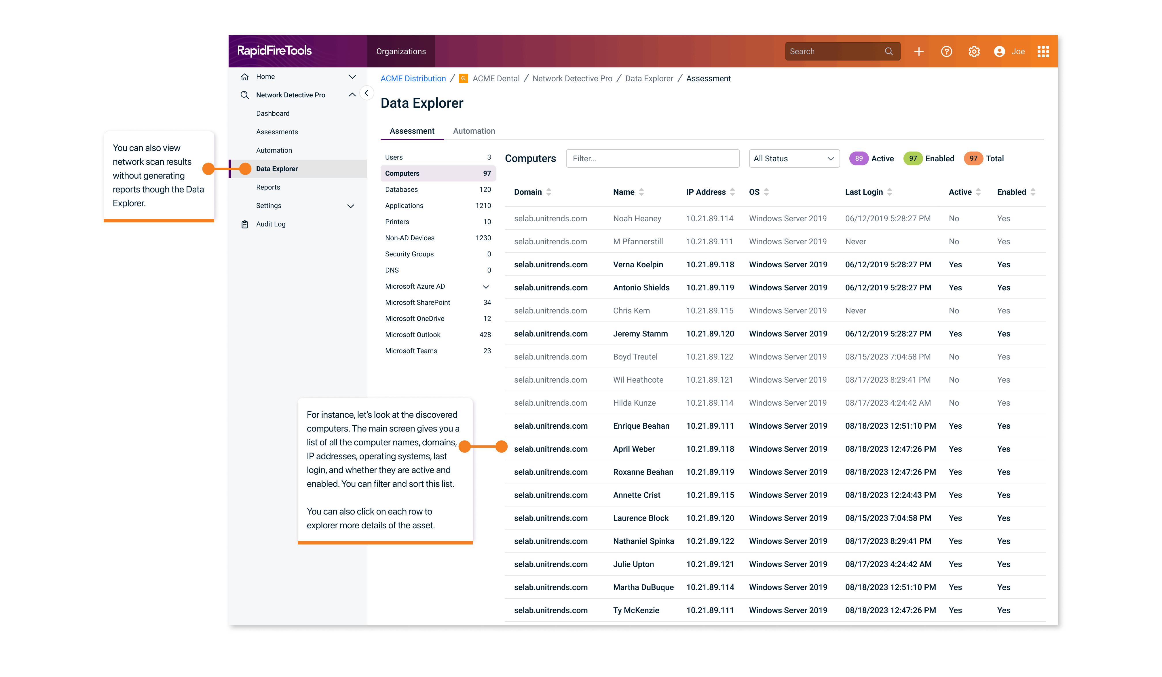
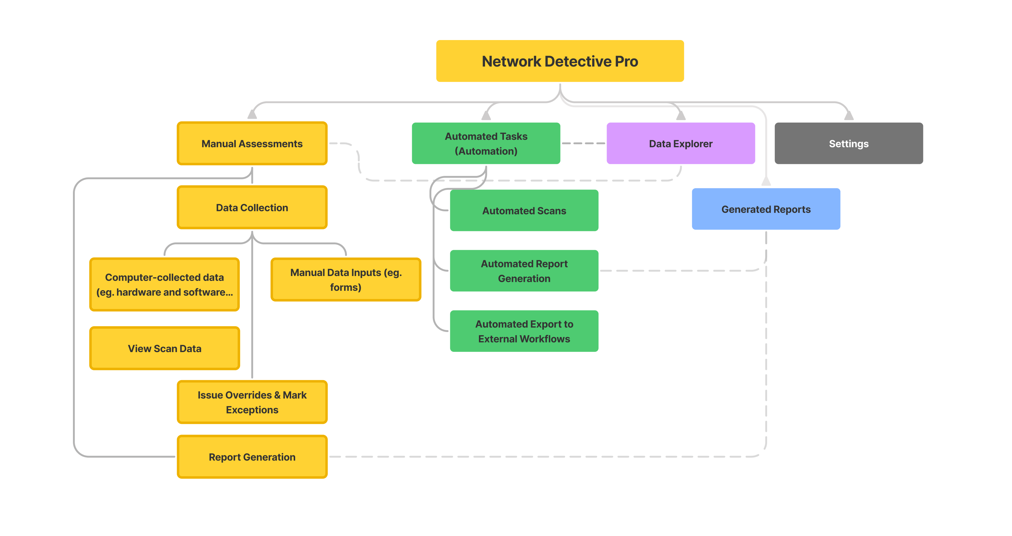
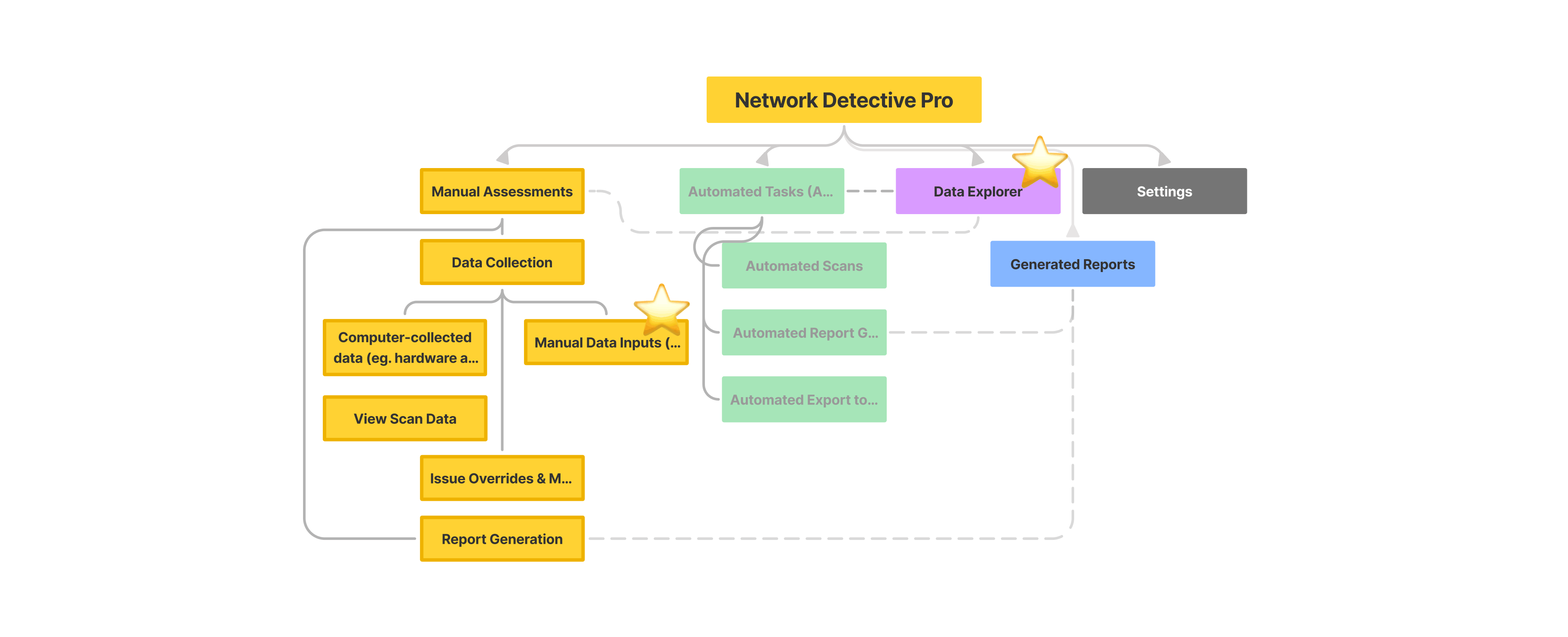
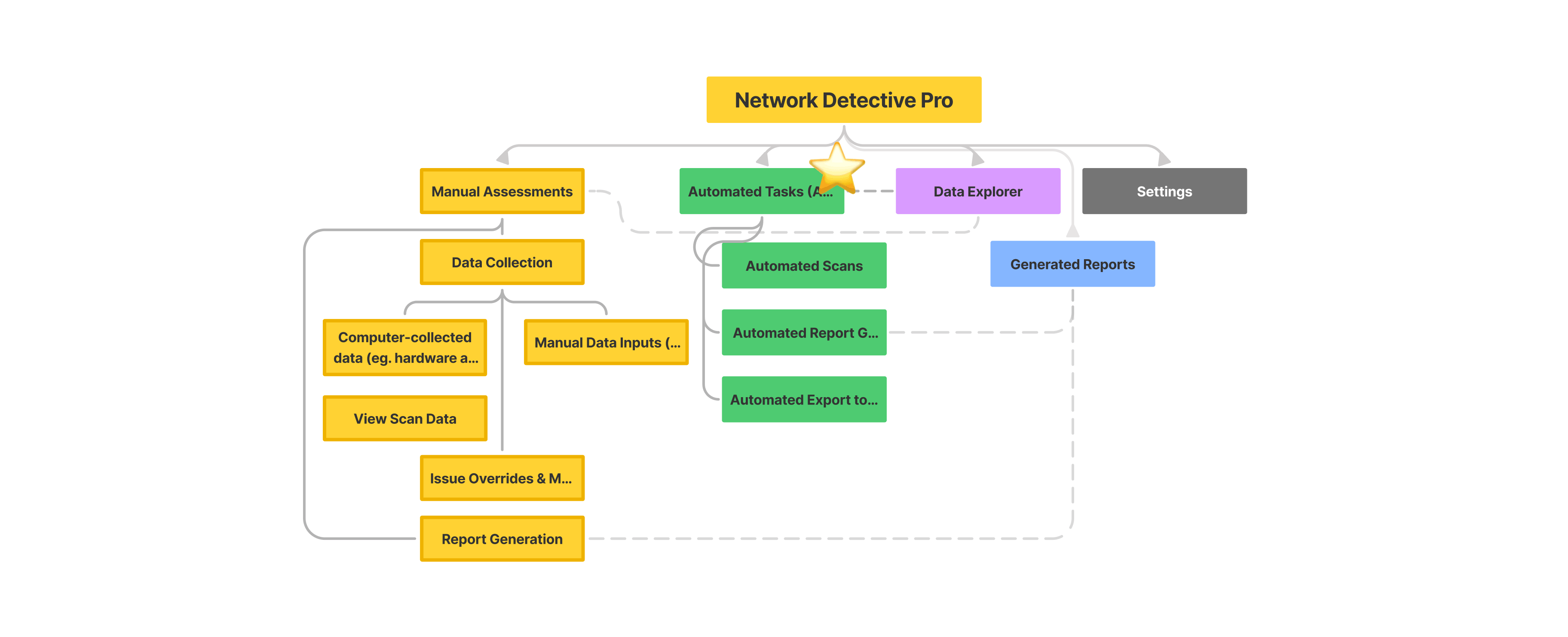
When a user onboards to NDPro, their main goal is to set up network and IT assessments for their client. There are two ways to do that: 1) manual assessment through computer scanning and manual form input, 2) set up tasks so they can be run automatically for recurring check-ins. Once assessments are done, users can view scans, generate reports, and explore the database.
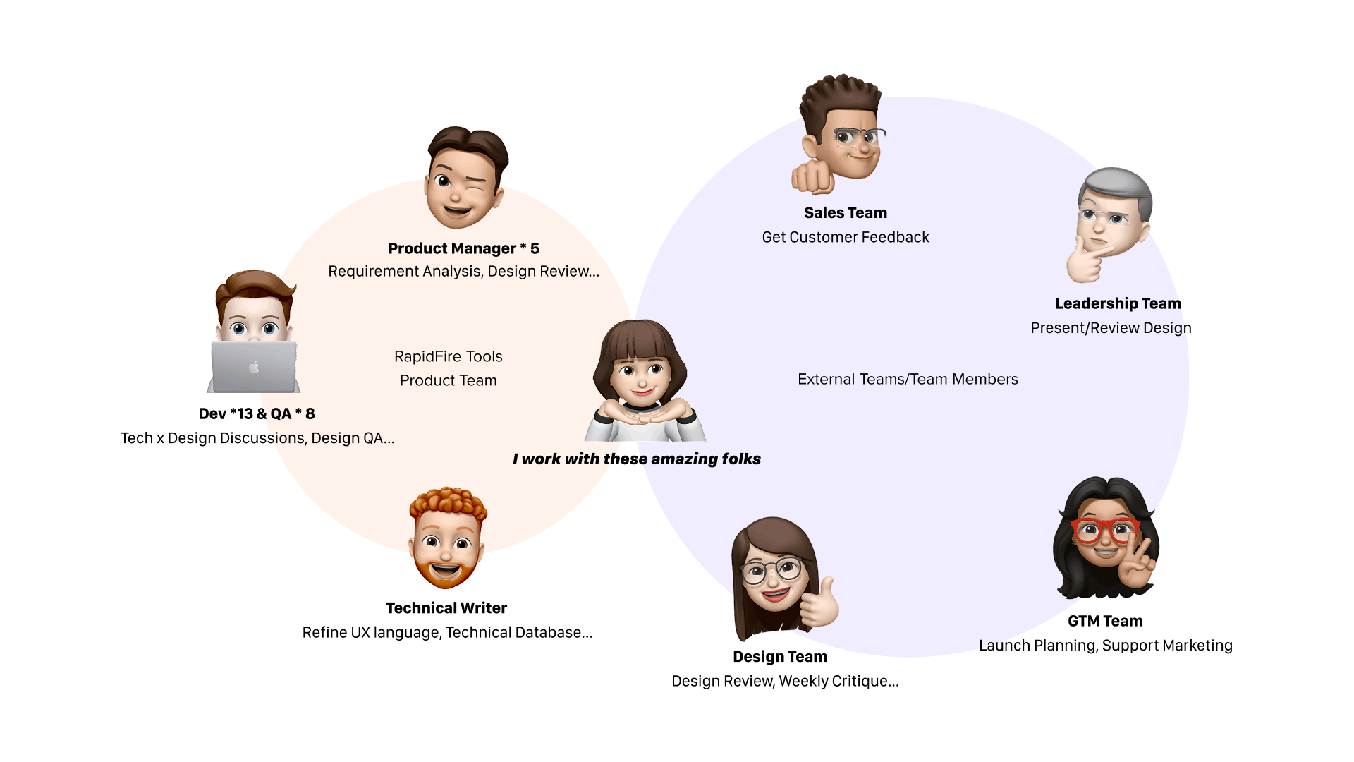
Because of the amount of work it takes to design and develop the entire product, we strategically divided into 4 phases spanning over 3 quarters, 6 JIRA epics.
Phase 1: MVP Launch
Phase 1 involved launching a minimum viable product with a redesigned UI. The goal was to excite users and gather early feedback.
- Rolled out an updated UI with basic functionalities
- Prioritized core actions for faster user adoption
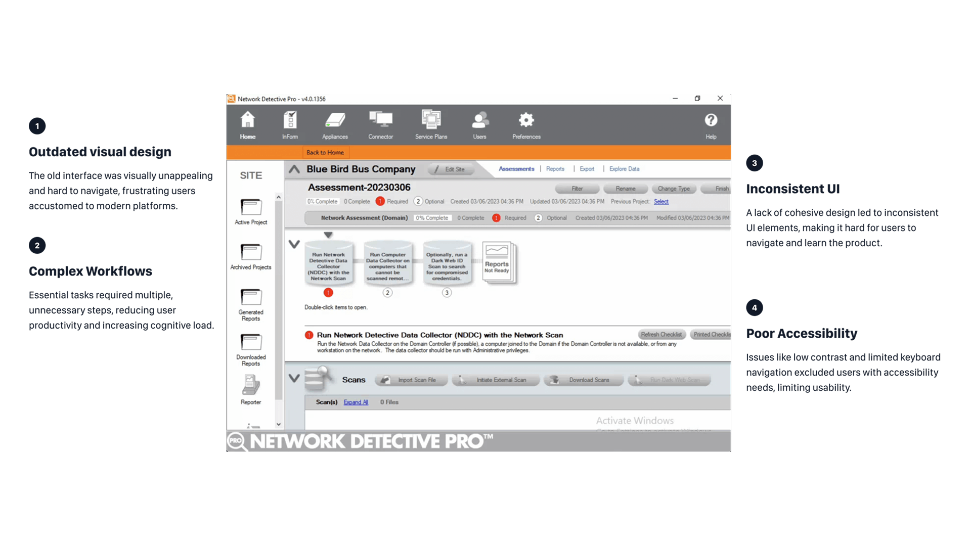
In this phase, features were quite limited. We focused on simplifying navigation, reducing clutter, and ensuring accessibility. We made key actions more prominent and reduced distractions, making the interface much easier to use.
Phase 1 MVP Launch — lay out foundations for data collection
Phase 2: Core Features Migration
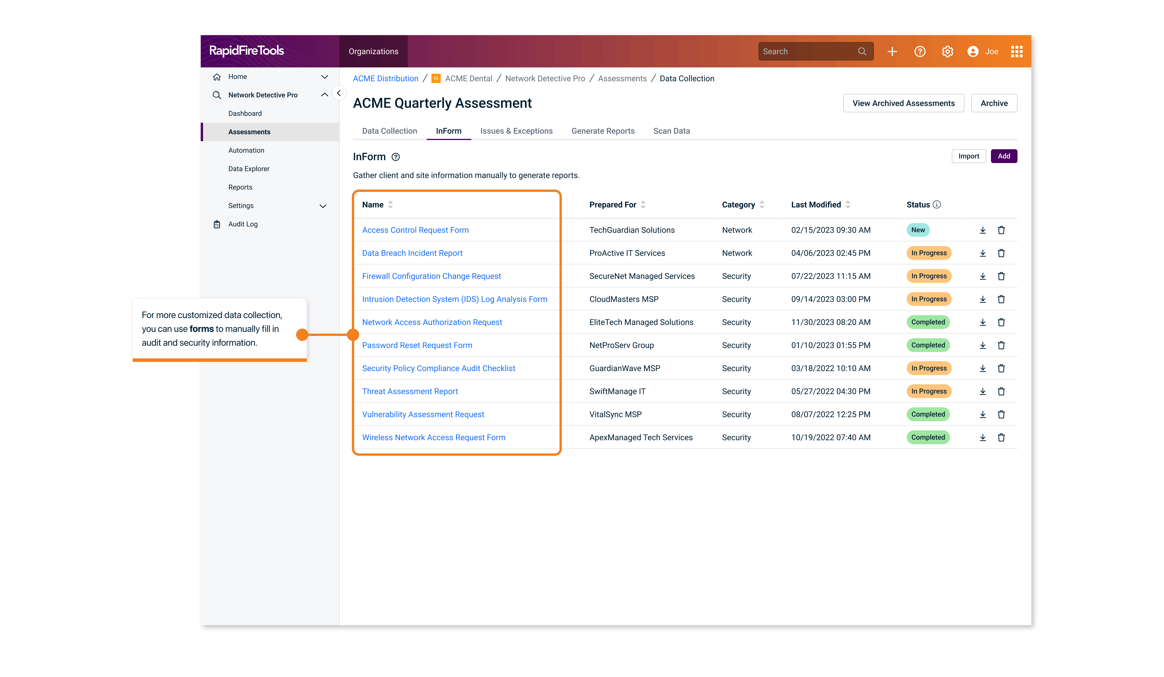
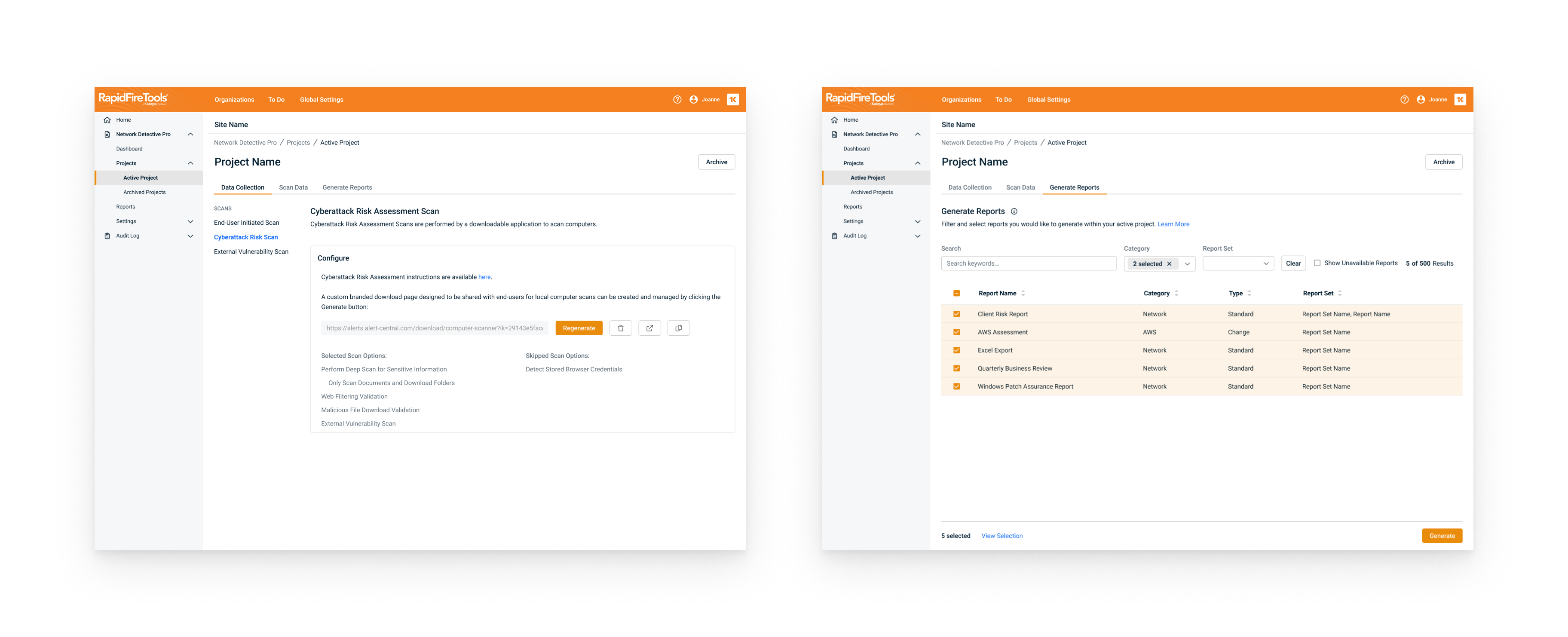
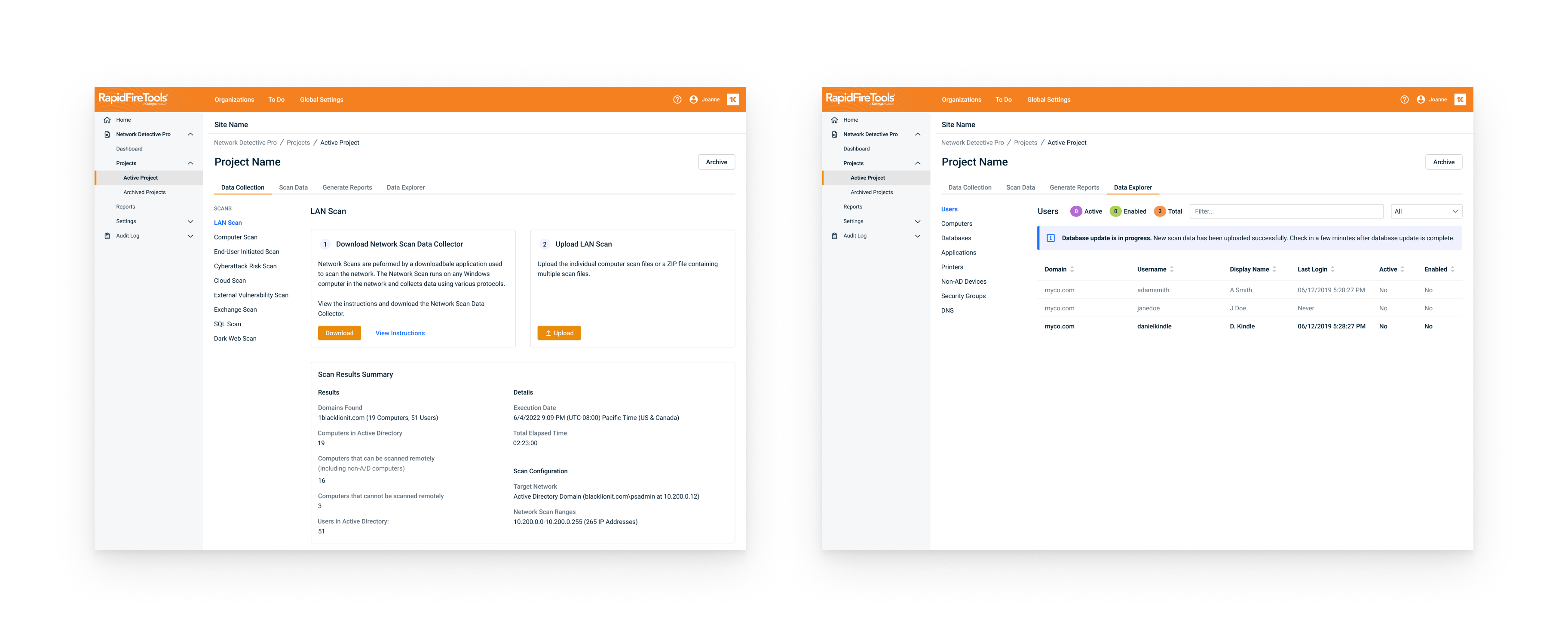
Phase 2 focused on migrating more core features, such as manual data collection through forms, and the ability to view their database after scanning.
- Enhanced user feedback loops for iterative improvements
- Reduced task completion times by 30%
We streamlined the entire workflow for common tasks like running manual assessments. We also added contextual help and tooltips to guide users through the interface, improving task flow efficiency.
Phase 2 Core Features — manual data collection and assessment flow
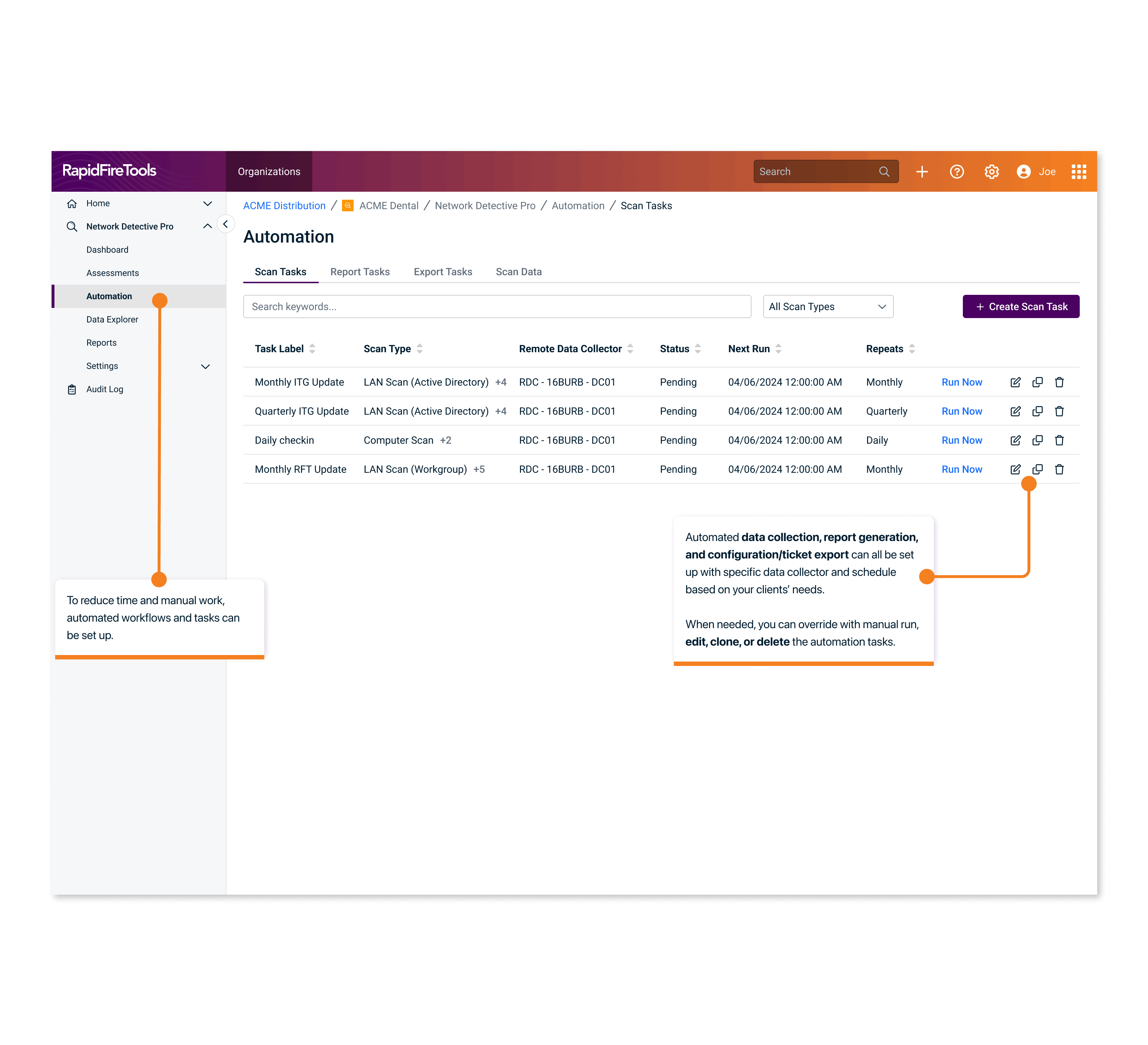
Phase 3: Automation and Scaling
Phase 3 was all about automation, which significantly improved efficiency. Close collaboration with engineering ensured a smooth integration of these features.
- Introduced automation for repetitive tasks
- Focused on scaling the design for power users
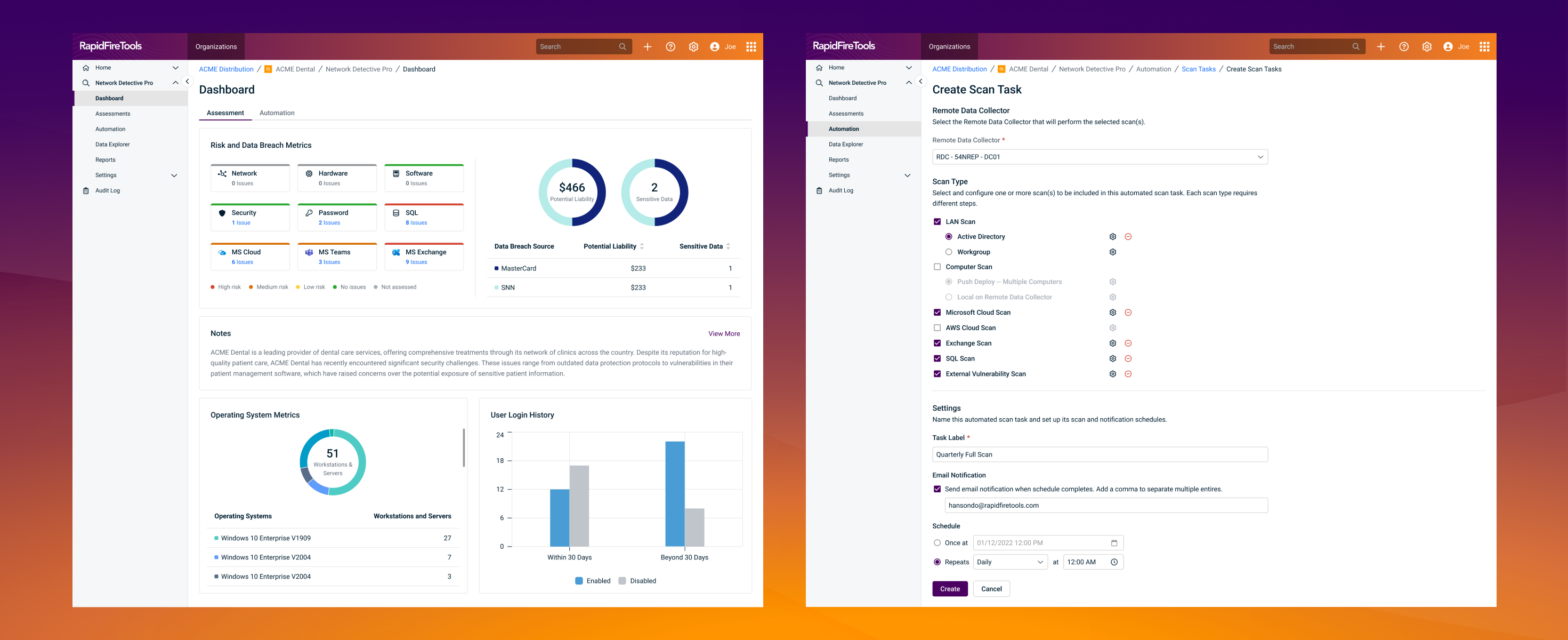
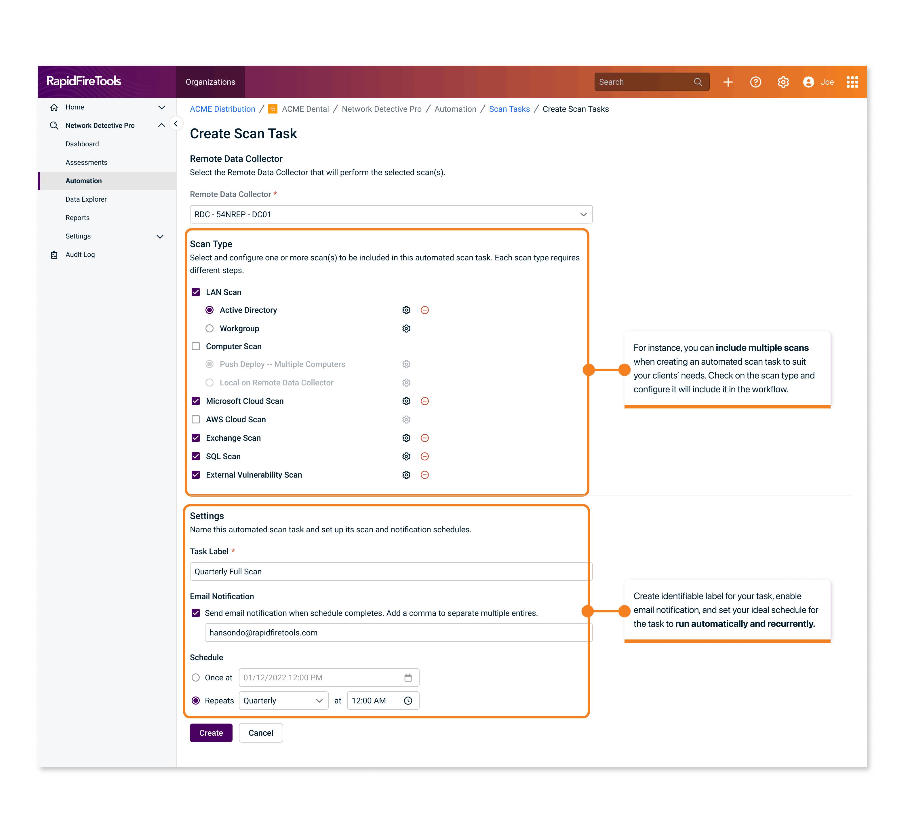
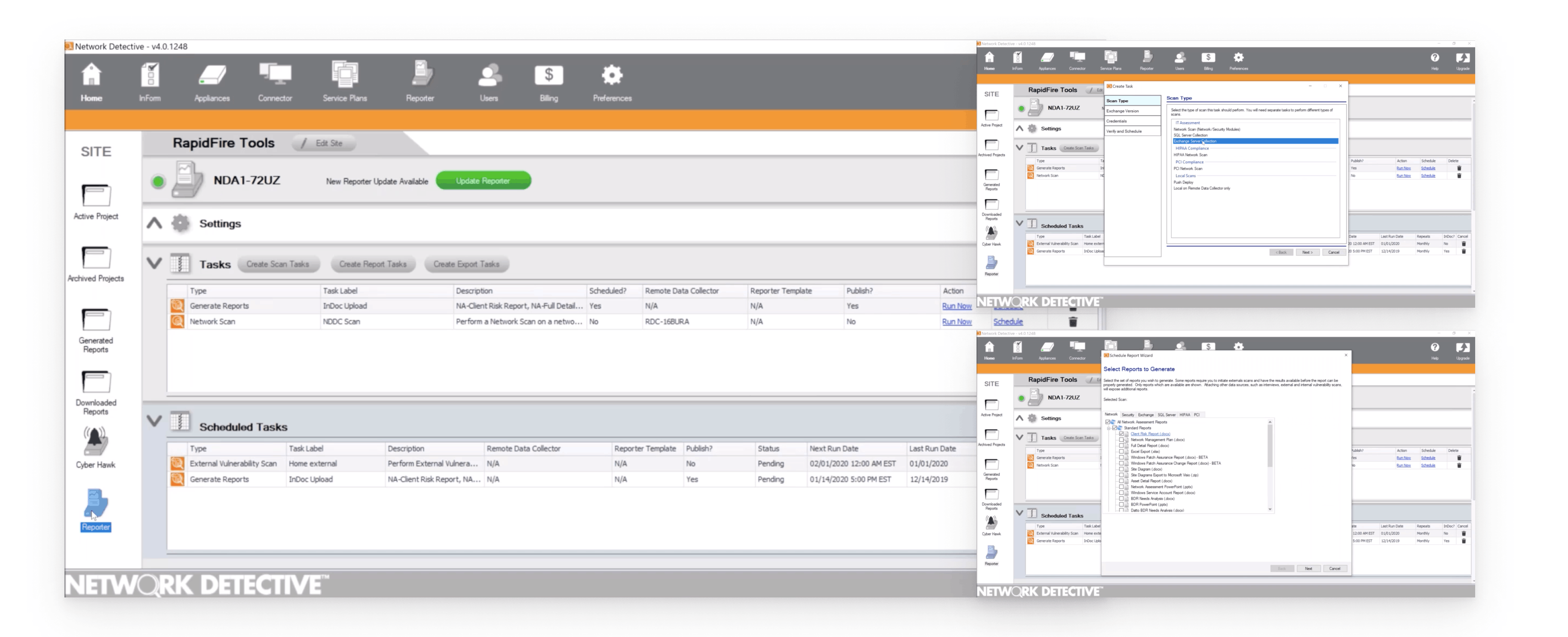
In the legacy Desktop version, users are able to set up automated scan tasks, report tasks, and export tasks. However, when talking to the sales and support team, we realized not many users use this feature because of its complex flow with countless modals, repetitive and uncategorized tasks.
Phase 3 - adding automation as the final piece to streamline workflows
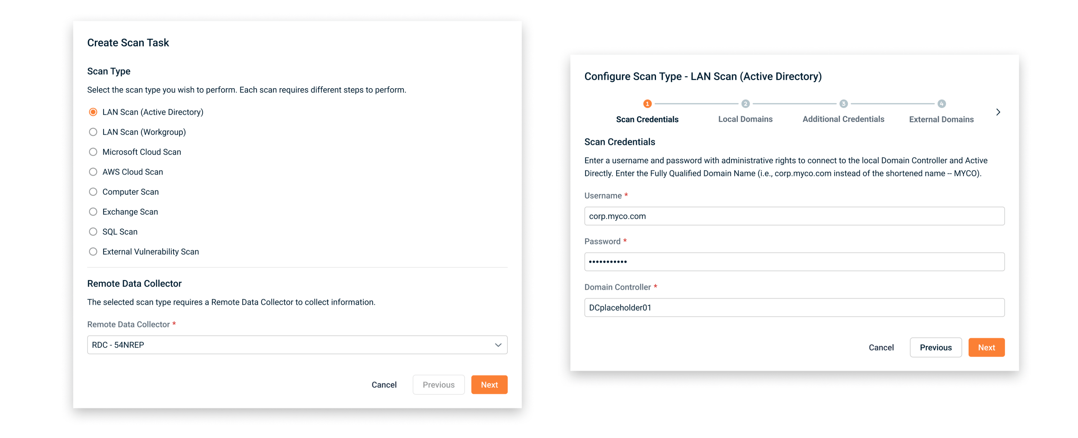
In the first iteration, I implemented the updated design system. However, it's still a very long process for setting up an automated task. Although it has a fresh look, it's still easy for users to quit in the middle of the process because of the waiting time, long flow, and lack of context.
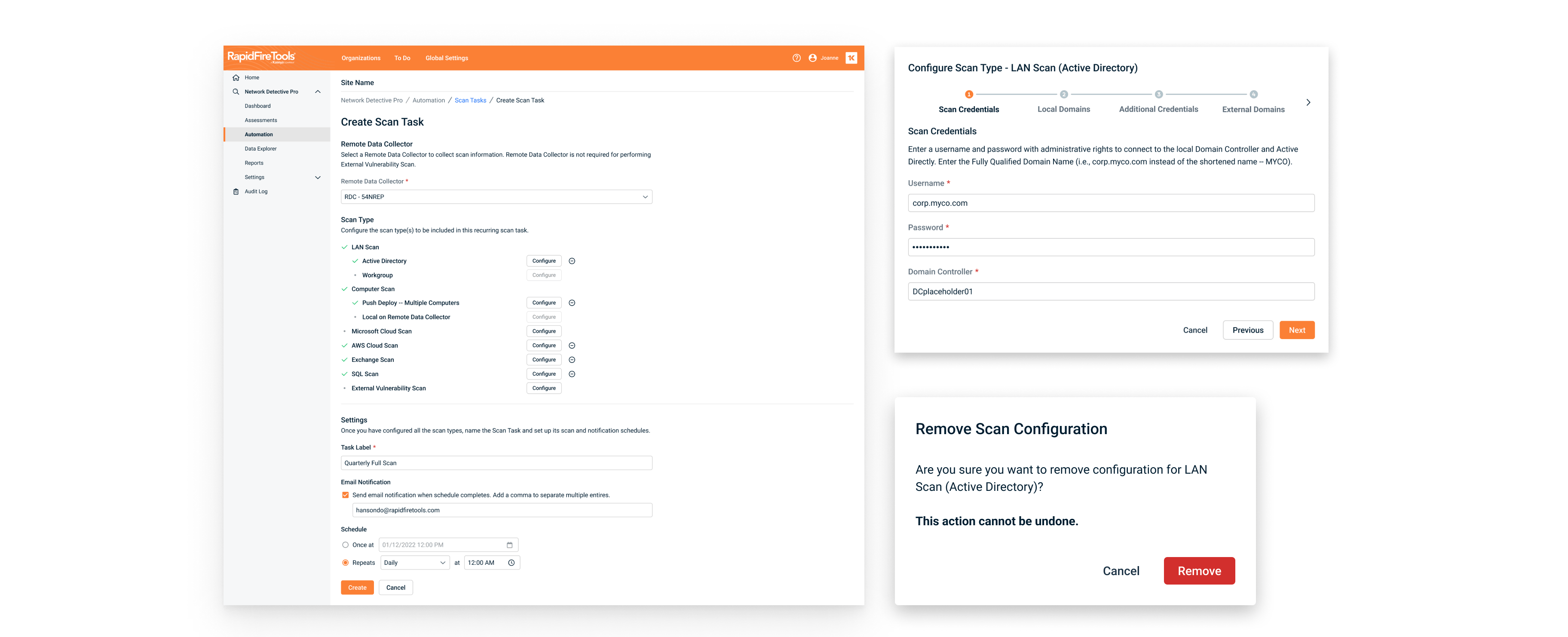
In a later iteration, I laid over the context on a full page, letting users configure scans they would like to automate separately. This allows users to reduce time they need to fill in repetitive information, such as selecting the data collector, verifying the schedule, etc.
Phase 4: Final UI Polish
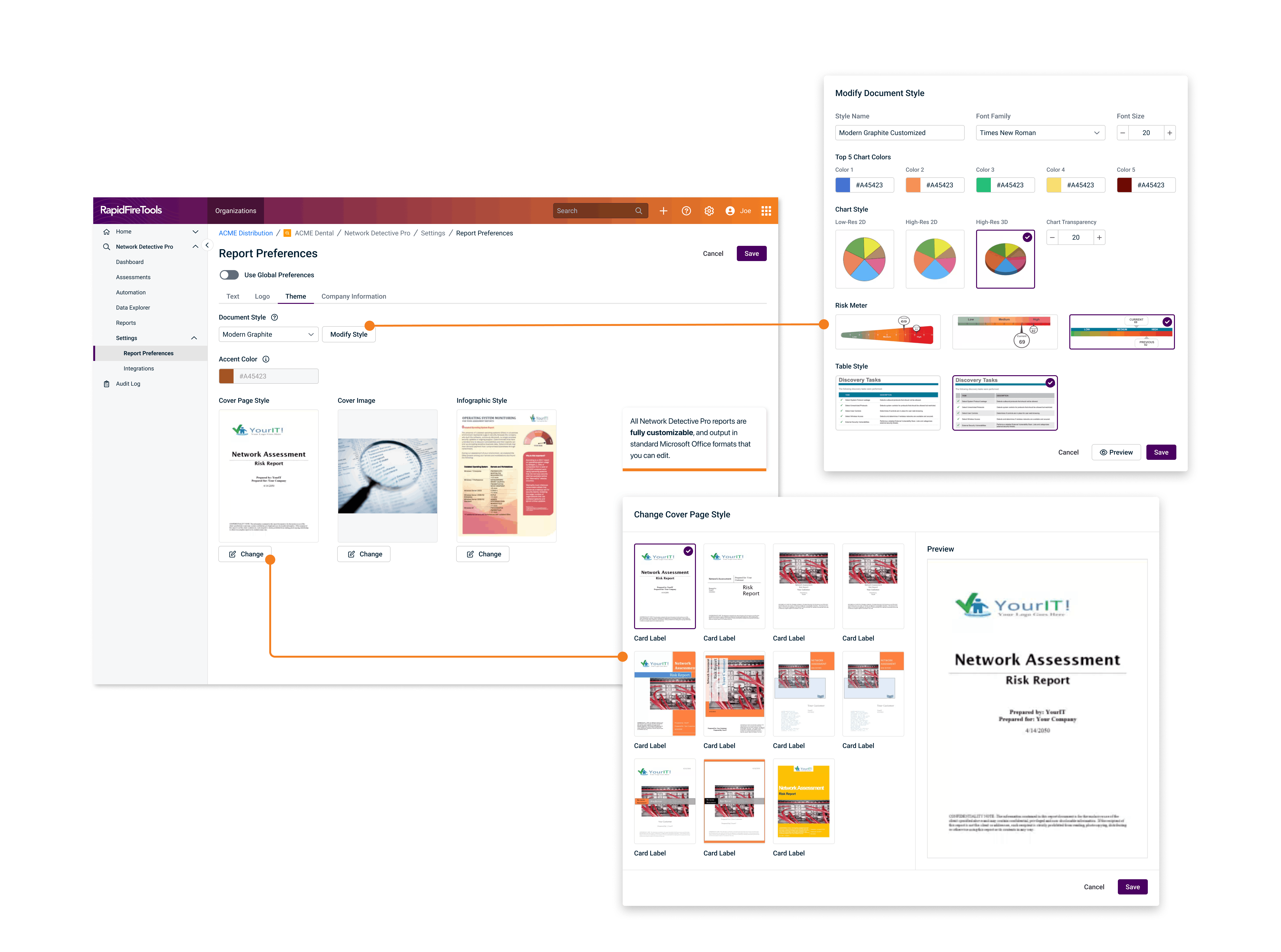
In the final phase, we polished the UI to ensure consistency across all Kaseya products.
- We addressed bugs and inconsistencies
- Conducted final usability tests to ensure everything worked smoothly
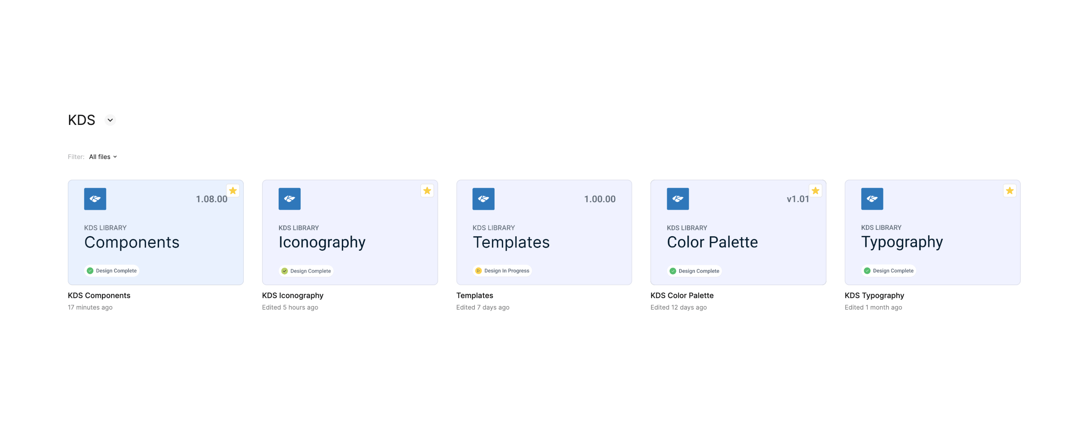
- Contributed to Kaseya Design System
Contributed to Kaseya Design System