Contact Me
Back to Work
B2B SaaS Design Systems Rebrand Leadership

Enable โ€“ Building a Scalable Design System & Leading Product Rebrand

From a broken engineering-led library to a company-wide design standard โ€” 50+ tokenized components, a full rebrand done twice, and AI-powered workflows that changed how designers build.

๐Ÿ™‹ Role
Senior Product Designer
โณ Period
Dec 2024 โ€“ Present
๐Ÿ“‚ Responsibilities
Design system architecture, component library, rebrand coordination, cross-functional leadership, AI workflow enablement
โš™๏ธ Tech
Figma, Storybook, Jira, Confluence, React, Web Components, Claude
๐Ÿ“ Location
Toronto, Ontario ๐Ÿ
Enable Design System showcase

What is Enable?

Enable is the AI-powered platform that helps companies turn commercial agreements into an engine for growth. Distributors, manufacturers, retailers, and buying groups around the world rely on Enable to manage pricing, rebates, and commercial agreements โ€” unlocking clarity, control, and confidence in their financial outcomes.

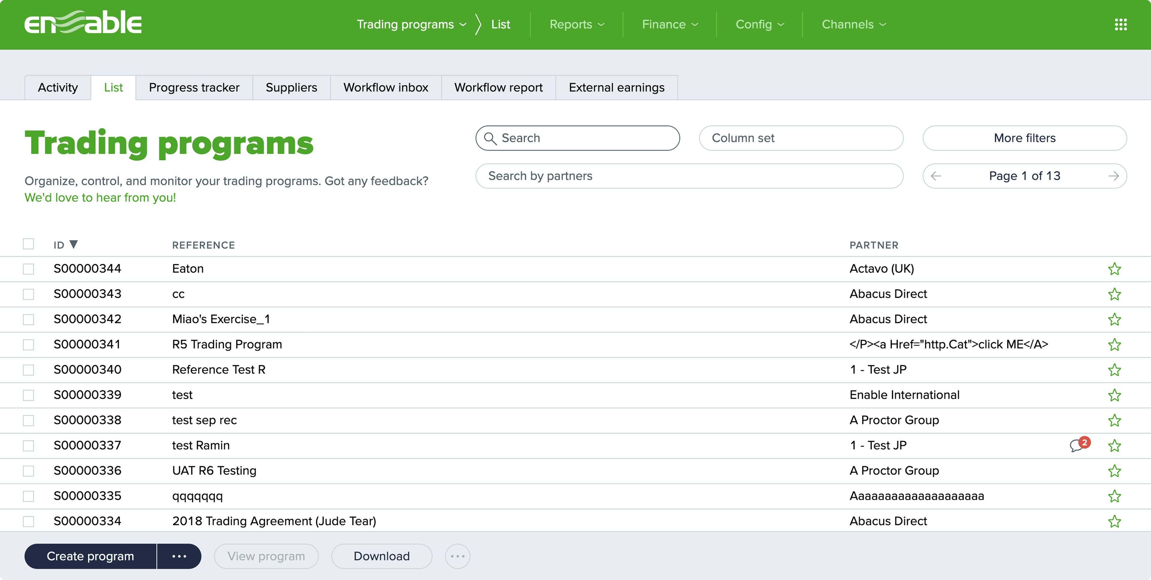
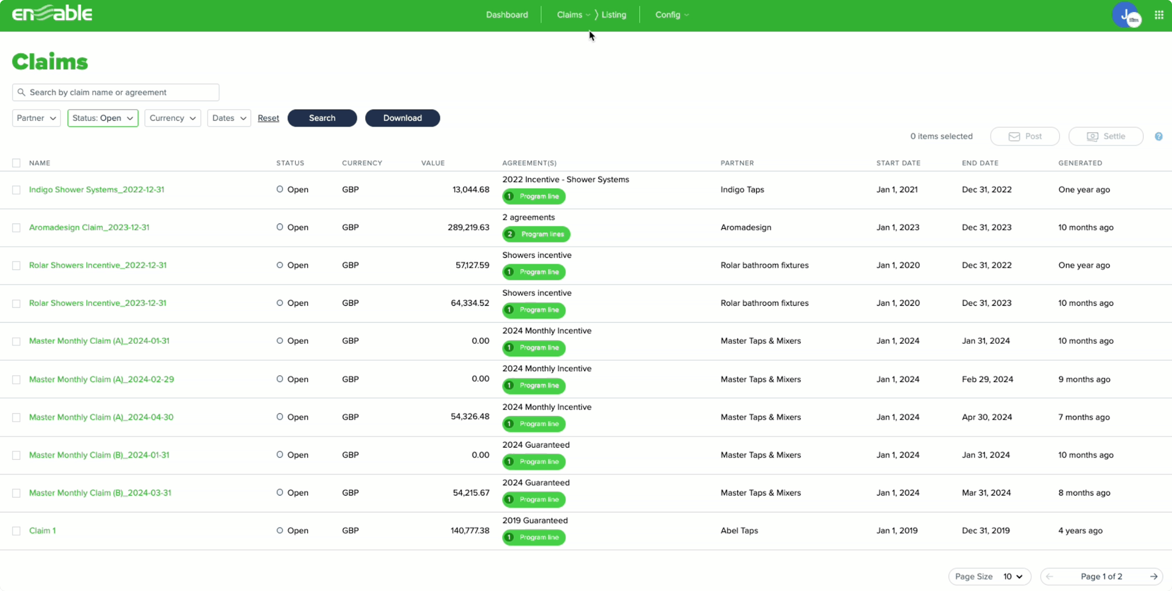
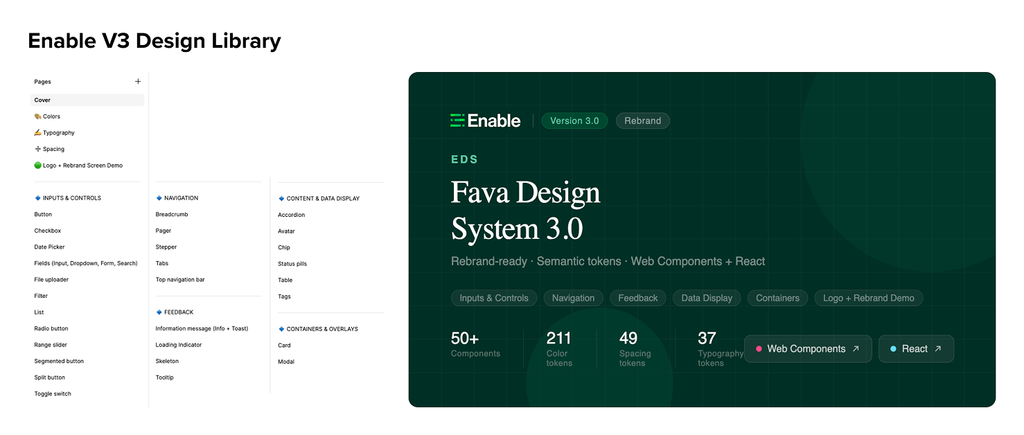
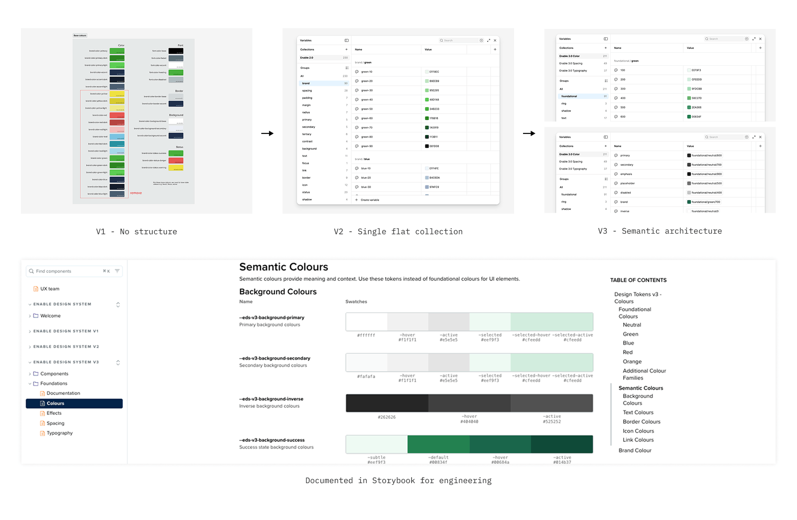
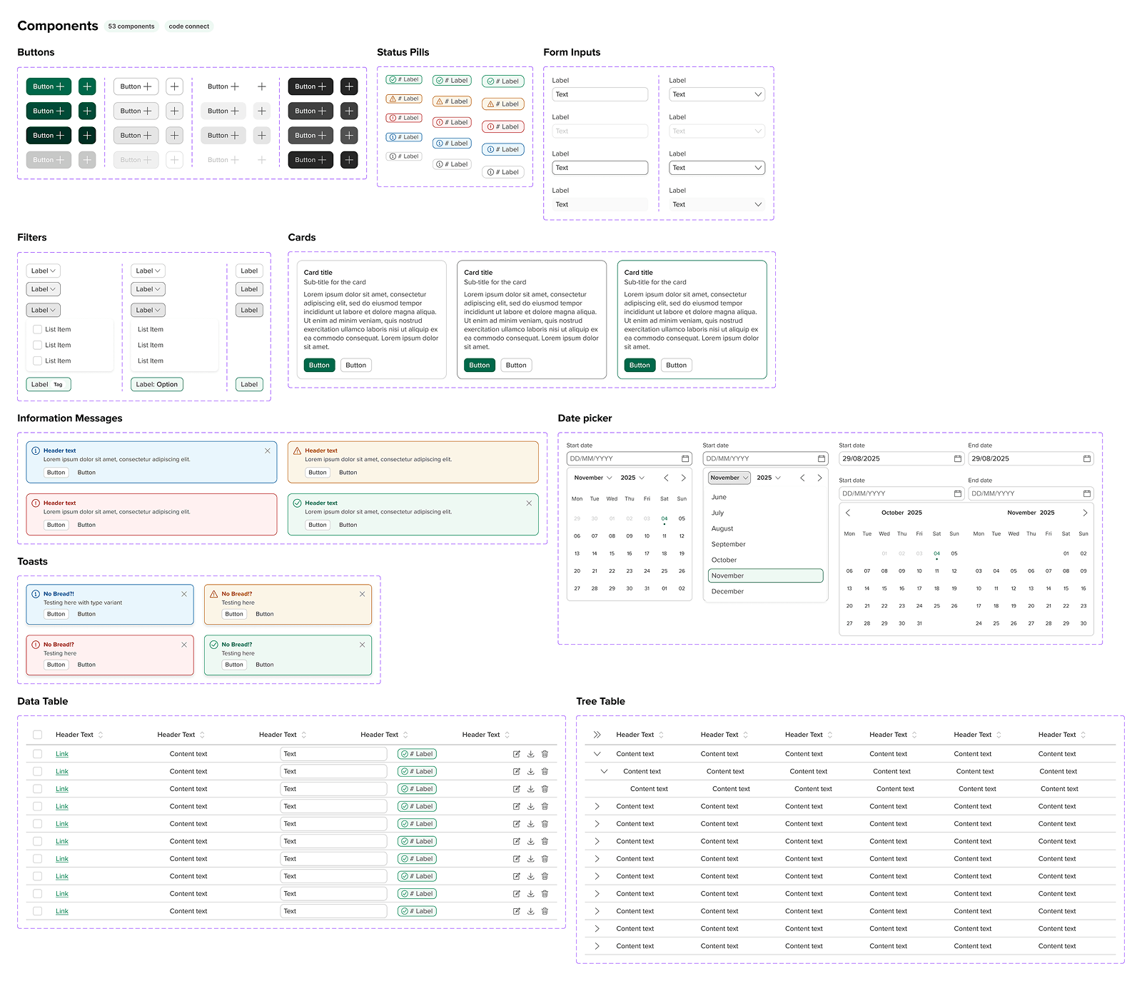
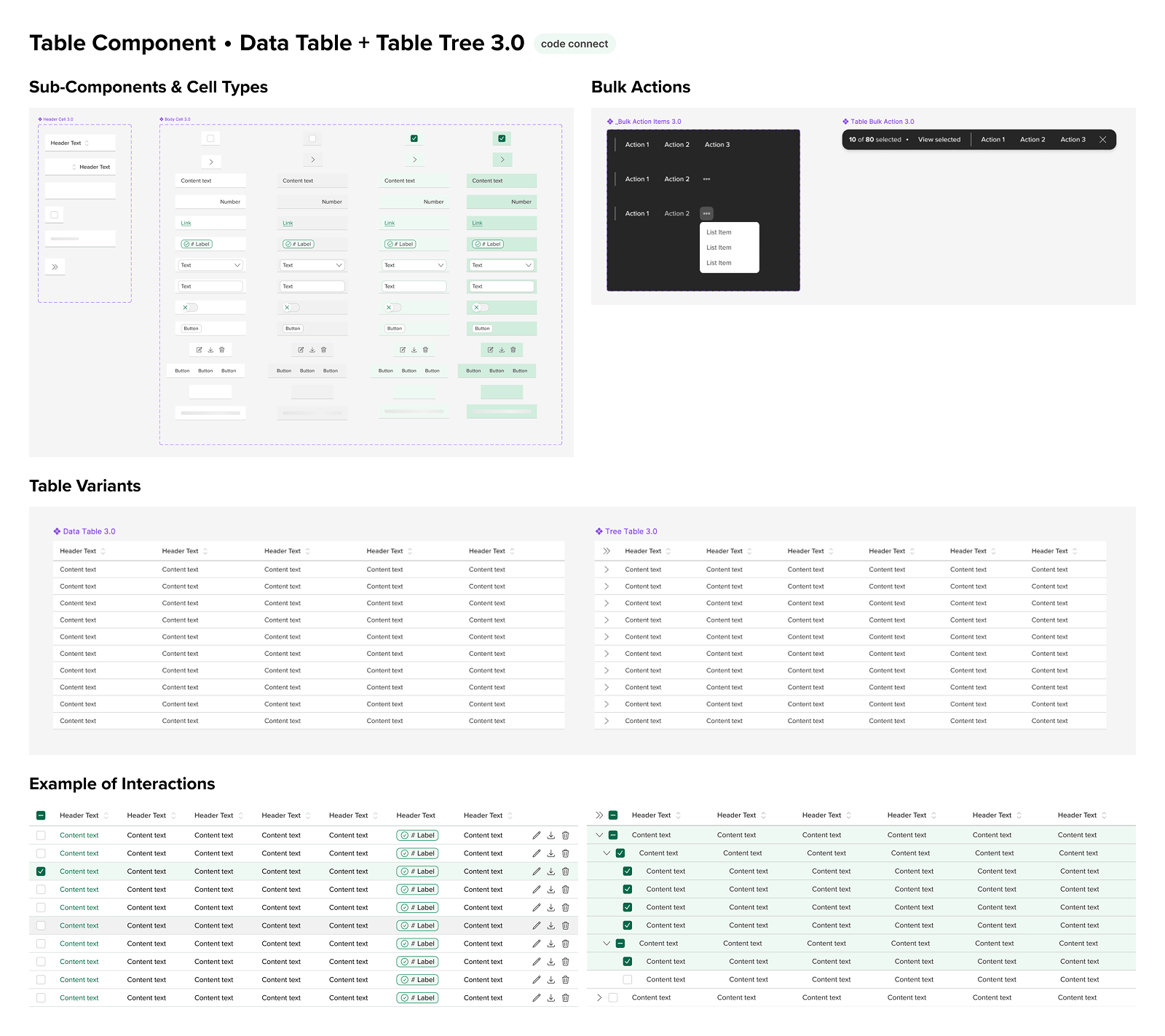
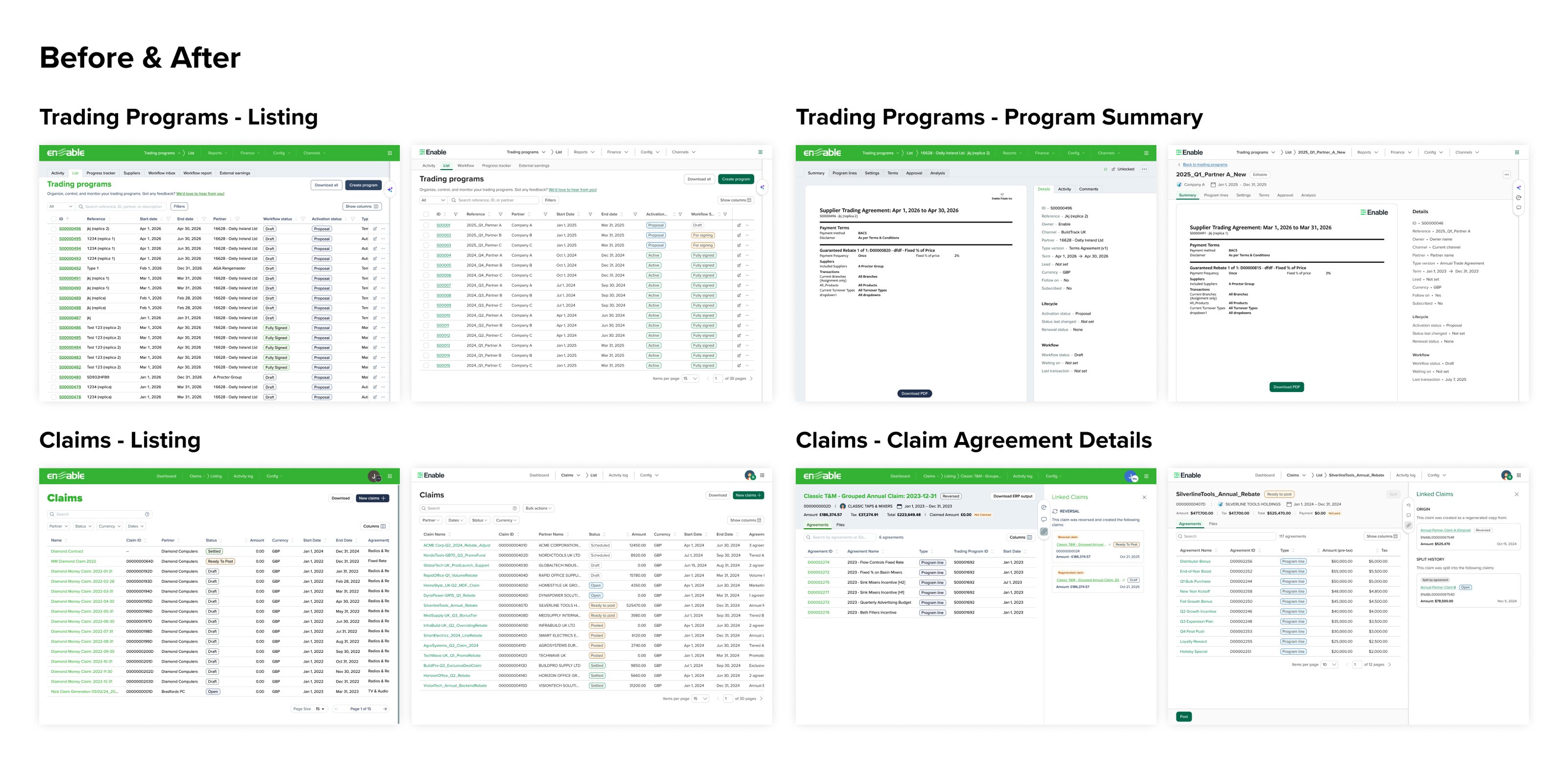
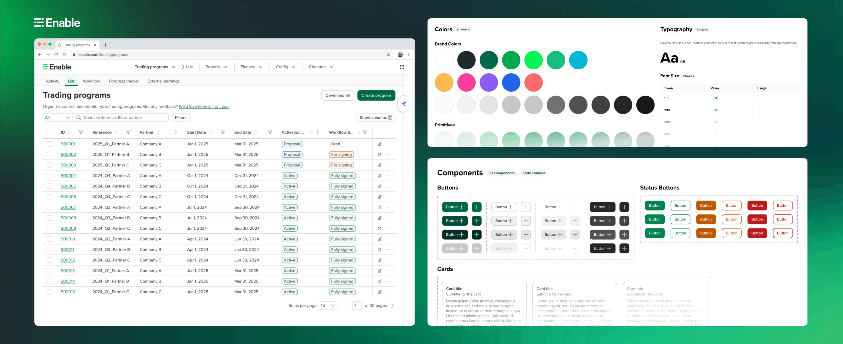
When I joined in November 2024, the design team was only 6 months old. The platform itself was a decade-old product โ€” engineering-led, visually inconsistent, and running on a fractured front-end architecture across Knockout, Angular, Blazor, and Kendo UI. Design system adoption across 30+ codebases was between 0% and 14.5%.

Legacy Trading Programs UI โ€” V1
Legacy Claims UI โ€” V1
Legacy platform โ€” Trading Programs and Claims showing V1 era: bright lime green, inconsistent components, dense layouts

What I walked into

The design team had attempted to build a component library โ€” but it was built by a UX engineer without designer involvement. Components existed only in Storybook, not in Figma. There was no token structure, no contribution model, and no documentation designers could reference.

V1 Storybook โ€” engineering-led design system
Enable V2 Design Library โ€” pages and cover
Left: V1 Storybook โ€” engineering-built, no design involvement. Right: V2 design library โ€” the design-led leap forward

The broader engineering context made this harder. With 4 different front-end frameworks across the platform, any design system work had to account for how components would be implemented differently across codebases. Design decisions couldn't exist in a vacuum โ€” they had to be grounded in what was technically buildable.

Three compounding problems

๐Ÿ—๏ธ

Fragmented system

No semantic token structure, no Figma component library, and a federated contribution model that wasn't working โ€” everyone owned the system, so no one did.

๐Ÿ“‰

Near-zero adoption

EDS adoption was between 0% and 14.5% across 30+ codebases. Design system was seen as a nice-to-have, not a default. The goal was to flip that.

๐Ÿ”„

Rebrand โ€” twice

A company-wide rebrand launched in October 2025. Then the CMO changed and new brand guidelines arrived. The entire color system had to be remapped โ€” again.

Individual contributor, de facto leader

I joined as a Senior Product Designer, but the nature of the work quickly evolved. When the federated contribution model failed, I stepped up as the sole owner of the design system backlog, building and reviewing every component. When our Design Director left in November 2025, I became the coordinator and de facto leader for a team of 5 designers for 4 months โ€” managing design system work, rebrand coordination, and ongoing product design without a director in place.

For engineering implementation, I paired closely with Varun, our first Design System Engineer hired in August 2025 โ€” writing component requirements, managing his Jira backlog, doing design QA on every PR, and co-authoring release notes.

๐ŸŽจ

Design system owner

Sole contributor for all V2 and V3 components. Managed backlog, set standards, reviewed all component work across the team.

๐Ÿท๏ธ

Token architect

Rebuilt the entire token structure from a flat V2 collection to a semantic V3 architecture โ€” foundational, semantic, and component layers.

๐Ÿ”ด

Rebrand coordinator

Led color mapping across V1โ†’V3 and V2โ†’V3, twice. Created QA process and documentation for the entire design team to execute the rebrand.

๐Ÿค

Cross-functional bridge

Collaborated with engineering leads, product managers, and a creative director to align design decisions with technical feasibility and business goals.

V1 โ†’ V2 โ†’ V3 โ€” three versions, one foundation

The design system didn't go from broken to perfect in one step. It evolved through three distinct versions, each triggered by a real business event โ€” the formation of the design team, the arrival of our first DS engineer, and a company-wide rebrand.

V1
Engineering-led ยท Pre-design team

V1: Engineering-led system

Before the design team existed, the UX Engineering team built a component library directly in Storybook. Components were widely adopted across product teams, but there was no Figma library โ€” only critical components were visually designed. Design decisions were implementation-driven. It provided engineering consistency but zero design scalability.

V2
Design-led ยท Dec 2024 โ€“ Aug 2025 70+ components

V2: Design-first, built in Figma

When the design team formed in December 2024, we initiated a new design-led system. The goal was to modernize the UI toward SaaS-standard quality, improve accessibility, and build a comprehensive component library that designers could actually use.

  • Started as a federated model โ€” 3 designers each contributing components
  • Federated model failed โ€” I stepped up as sole DS owner and rebuilt the backlog with impact-prioritized components
  • Weekly design critique cycle โ€” walk team through, peer review, merge, publish, document in Confluence
  • Design-complete but not yet implemented in the main engineering codebase
Enable V2 Design Library
V3
Rebrand-ready ยท Aug 2025 โ€“ Present 50+ components ยท Live in Storybook

V3: Semantic tokens, rebrand-ready, code-connected

In August 2025, we hired Varun as our first Design System Engineer. I paired with him to implement V2 components in Storybook as Web Components. In parallel, the company launched a rebrand โ€” which led me to rebuild the entire token architecture into a proper semantic structure to support systematic color changes across the platform.

  • Rebuilt token structure: primitive โ†’ semantic โ†’ component layering
  • Three separate collections: Enable 3.0 Color (211 tokens), Spacing (49), Typography (37)
  • Added Figma Code Connect โ€” components linked directly to Storybook implementations
  • Available as both Web Components and React library
Enable V3 Design Library
Token architecture evolution V1 โ†’ V2 โ†’ V3
Click to expand
Token architecture evolution โ€” V1 had no structure, V2 was a single flat collection of 230 tokens, V3 introduced semantic architecture across three separate collections
Final Designs โฉ Final Designs โฉ Final Designs โฉ Final Designs โฉ Final Designs โฉ Final Designs โฉ Final Designs โฉ Final Designs โฉ Final Designs โฉ Final Designs โฉ Final Designs โฉ Final Designs โฉ

The system in action...

Imagine you're an IT administrator at a Managed Service Provider, responsible for delivering seamless network and security support to a busy medium-sized dental organization.

01

50+ Components, Code Connected

Component Library

A comprehensive library covering every UI pattern in the product โ€” from simple buttons and status pills to complex data tables with sortable headers, inline cell editing, tree expansion, and bulk action toolbars. Every component is tokenized, accessibility-tested, and available in both Figma and Storybook.

Enable component library overview โ€” 53 components
Click to expand
02

Deep Component Thinking

Table Component โ€” A Study in Depth

The table component alone contains sub-components covering every cell type variant, row states, selection states, tree/expandable rows, bulk action toolbars, inline cell editing, column resizing, and sticky headers. It's the component I'm most proud of โ€” and the one that ships directly to engineering via Code Connect.

Table component โ€” sub-components, variants, interaction states
Click to expand
03

Before & After

Platform Transformation

The impact of the design system is most visible when you put V1 and V3 side by side. The same features โ€” Trading Programs, Claims โ€” rebuilt with consistent components, accessible color contrast, and a clean visual language. Customers described the new UI as clean, modern, and joyful to use.

Before and after โ€” V1 vs V3 across Trading Programs and Claims
Click to expand
04

Design to Code

Storybook Implementation

Every component exists in both Figma and Storybook โ€” fully documented with usage guidelines, API controls, and interactive examples. The Table component alone covers 12 story variants including sortable, compact, striped, loading, disabled, sticky header, and resizable columns.

V3 Table component in Storybook with controls and documentation

How the system actually gets built

The design system runs on two parallel workflows โ€” one for design contribution, one for engineering implementation. These aren't separate silos; they feed each other through a clear handoff process I defined and own.

Design contribution flow and design-to-engineering flow
Click to expand

Every component goes through a weekly design critique, peer review by at least two designers, a Figma branch merge, library publish, and Confluence release notes โ€” before it even reaches engineering. On the engineering side, I write every Jira ticket, prioritize Varun's sprint weekly, do design QA on every PR, and write the Teams announcement when a component ships.

Release cadence: Components are published at the end of each week, with advance notice to the design team to avoid disrupting work in progress. Every publish is logged in Confluence with a version history note in Figma โ€” creating a full audit trail from design decision to production code.

The rebrand that happened twice

In October 2025, Enable launched a company-wide rebrand โ€” new logo, new brand colors, new icon set (Heroicons โ†’ Streamline). I was responsible for translating the brand guidelines into a scalable product token architecture and coordinating the rollout across design and engineering.

Then the CMO changed. New brand guidelines arrived. The entire color system had to be remapped โ€” again. In total, I produced four complete color mapping documents: V1โ†’V3, V2โ†’V3, V1โ†’V3.1, and V2โ†’V3.1. Each mapping covered every semantic token category โ€” text, background, border, icon, link โ€” with hex values, CSS variable names, and token replacement CSS.

Rebrand color mapping โ€” V1โ†’V3, V2โ†’V3, before/after color ramps
Click to expand

The key brand shift: the legacy bright lime green (#34B233, #178816 in V1) became a deeper, more accessible teal-green (#00684a, #00834f) in V3.1. This change improved color contrast ratios across the entire product โ€” a meaningful accessibility win alongside the visual modernization.

Rebrand QA process โ€” Figma instructions and Jira sprint tracking
Click to expand
Rebrand QA โ€” step-by-step designer instructions in Figma and sprint tracking in Jira showing multi-team coordination

The unlock: designers shipping production-quality prototypes

The final piece โ€” and the one I'm most excited about โ€” is what happens when you pair a well-built design system with AI-powered tools. The collaboration between me and our design system engineer made it possible to implement Figma Code Connect and Figma MCP for our components, enabling a workflow that didn't exist before.

Designers can now use Figma Make with our EDS React library selected, or use Claude Code, to build realistic prototypes โ€” and even merge PR branches โ€” using real V3 components. The prototypes are no longer mockups. They're actual React code using production components.

AI-powered design workflow and prototype examples
Click to expand
Why this matters: This workflow exists because the design system was built right โ€” semantic tokens, Code Connect annotations, and a React library that mirrors the Figma components exactly. Without the design system foundation, there's nothing for the AI to reference. The system is the enabler.

From 0โ€“14.5% adoption to a company standard

The design system went from being a nice-to-have to the default choice for new feature development. Customers noticed the difference โ€” describing the new UI as clean, modern, and more accessible. Engineering teams reduced duplicated UI work. The rebrand, which could have taken months of manual updates, was executed systematically through the token architecture.

๐Ÿ“Š
10k+
Weekly component usage in Figma across the design team
๐Ÿงฉ
50+
Tokenized components shipped across V2 and V3 libraries
๐ŸŽจ
297
Design tokens across color, spacing, and typography in V3

Building design maturity under pressure

The most meaningful outcome isn't a metric โ€” it's what the team said. Designers told me I made their work easier and they felt secure knowing I was the one setting the quality bar on the design system. Engineering leaders were impressed by the token documentation and color mapping work, specifically noting how it was grounded in technical feasibility with clear implementation guidance.

During the 4-month leadership gap (November 2025 โ€“ March 2026), I kept the design system moving, the rebrand on track, and the team coordinated โ€” without a director in place. The rebrand reached its target release with design QA complete and engineering rollout in its final phase.

What I built beyond components: A contribution process, a release cadence, a QA workflow, a cross-functional announcement system, and a token documentation standard that engineering teams could actually use. The system is only as good as the process around it.

What I learned

1

Ownership beats collaboration models on day one

The federated model failed because everyone had other priorities. A design system needs a clear owner โ€” someone whose primary job is to hold the quality bar, unblock others, and keep the backlog moving. Stepping into that role rather than waiting for it to be assigned was the single most impactful decision I made.

2

Semantic tokens are an investment that pays off in a rebrand

When the rebrand happened โ€” and then happened again โ€” the token architecture I'd built meant we could map changes systematically rather than hunting through every component. If the tokens had been flat and unstructured, the rebrand would have been months of manual work. It wasn't.

3

Documentation is a force multiplier

The QA instructions I wrote for the rebrand meant 3 designers could execute a systematic color rollout across the entire product without my constant involvement. The Confluence release notes meant engineering teams could adopt new components without having to ask me what changed. Good documentation multiplies your impact beyond what you can do alone.

4

The best design systems enable AI workflows

I didn't set out to build a system that would power AI prototyping. But when Code Connect and Figma MCP became available, a well-structured system was ready for them. The lesson: build the foundation right and new capabilities come for free. The system is the platform.